
Created on 99designs by Vista
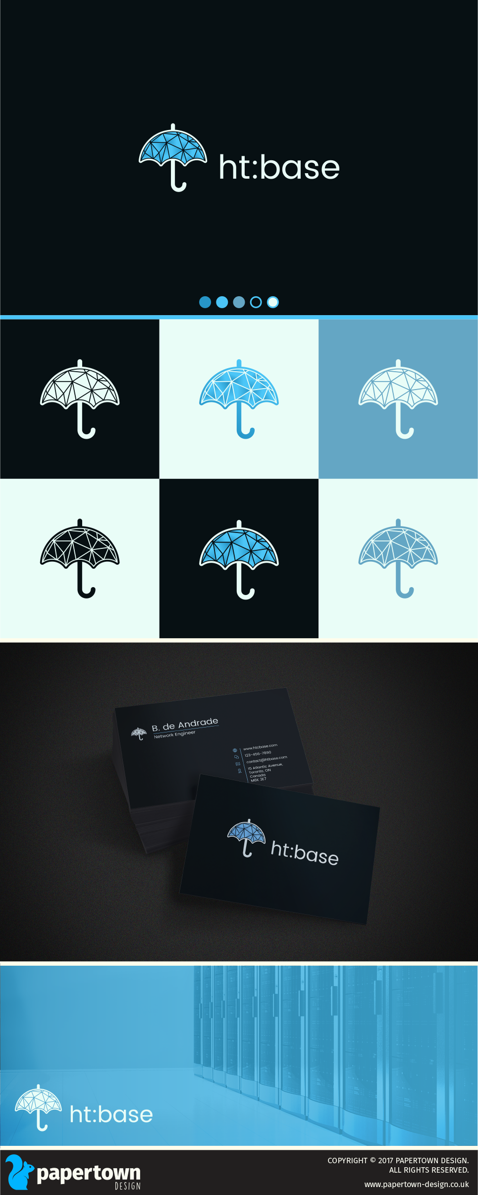
The contest holder wanted a versatile logo for their cloud networking company. Seeing that most cloud companies depict a cloud in their logo, I decided to go a different route and use and umbrella to signify that connection. As technology advances, their products will eventually all come under an umbrella too. The CH has an existing website, so the typeface was the base point and the umbrella was designed to mimic the characters in the text.
The inside of the umbrella is loosely based on a network depiction and the connections we make across the web, and while you can have a lot of colour variations, I thought I'd go with a polygonal gradient to give it a bit of depth.