
Created on 99designs by Vista
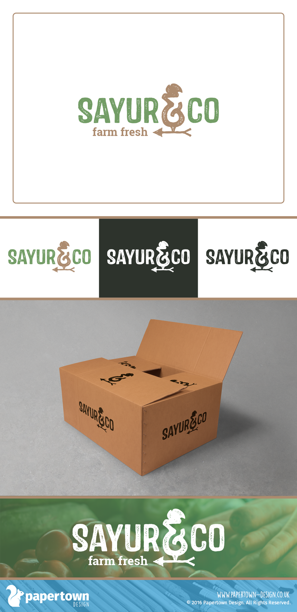
The client wanted to depict farm-to-table freshness without straying to close to well-known brands in the industry. Instead of leaves, I wanted to do something a little more unique by modifying the ampersand into a weathervane and using a distressed effect on the typeface to create a raw, rustic look.