Futuristic Dystopian YA Book Cover

0
Created on 99designs by Vista
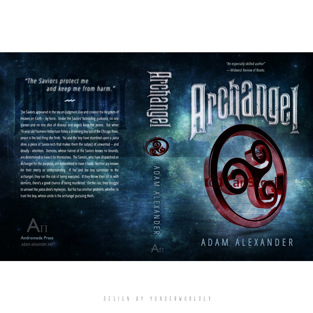
The author wanted a symbol-centric cover similar to The Hunger Games and Divergent, and had a design idea of a futuristic, "Nazi-fied" version of Chicago's flag wherein the stars are replaced with four red triskelions.
Instead of literally incorporating a flag, I opted to interpret the author's vision of the cover. The single triskelion and the strong typography gives a more definite and interesting focal point, without being too busy. The colors were initially same as flag's, but the darker blue background with space effect gives the cover a more futuristic dystopian scifi feel, which the author prefers.