
Created on 99designs by Vista
The idea behind the design is to be playful, dynamic, and to be eye catching.
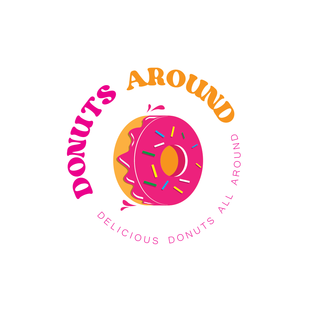
The Icon is a rolling donut with a little splash from the jelly to make it seem like it's moving/rolling. This element adds a touch of playfulness. While the brand name is purposely rotated to make it more dynamic and playful.
Primary colors are pink and orange since they are complimentary and easy for the eyes.