
Created on 99designs by Vista
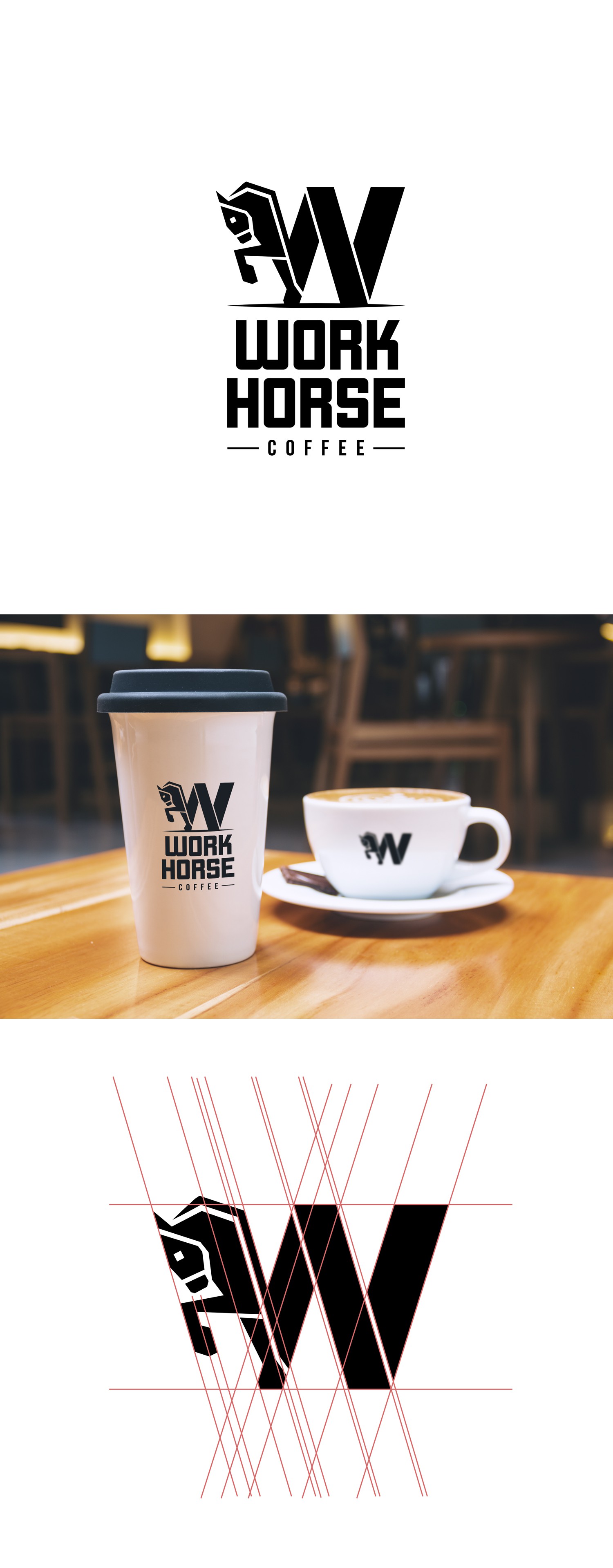
Combined the first letter of the coffee shops name with a working horse. A geometrical approach using all the same angles for the main lines of the logo. The heavy font emphasizes the strong and powerful character of a working horse.