Abstract logo for kitchen furnishings

2
Created on 99designs by Vista
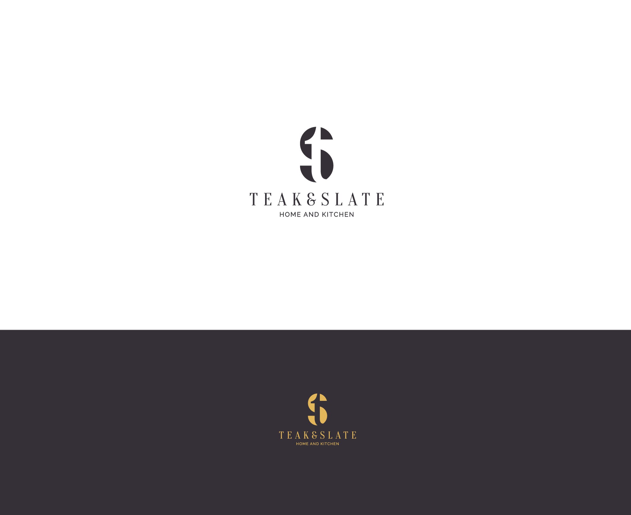
The client was open for anything as long as it was stylish and flexible so choosing to go for the initials seemed reasonable. I found a very visually appealing way of combining those two letter which in turn served well to illustrate the contrast between two materials - teak and slate - one being fragile (small serif "t") and the other bold ("S" in the back).