
Created on 99designs by Vista
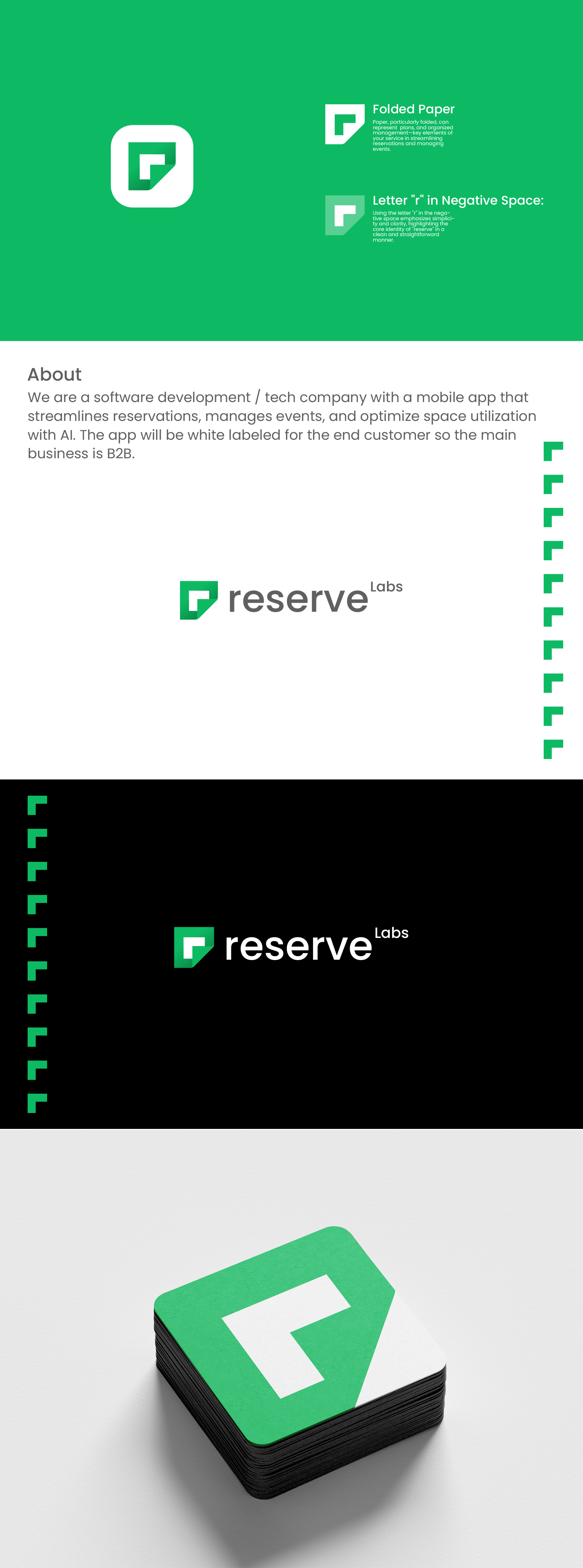
In this logo design, I incorporated a clever concept by using the letter 'r' within the negative space of folded paper to create the pictogram. The name 'Reserve Labs' is integrated in a sophisticated manner, with emphasis on the word 'reserve' while 'labs' is presented as a subname in a smaller size, positioned in the top right corner like a trademark or copyright symbol. The green color adds a sense of freshness and makes the logo more visually appealing.