1564 winery brand identity rebuilding.

2
Created on 99designs by Vista
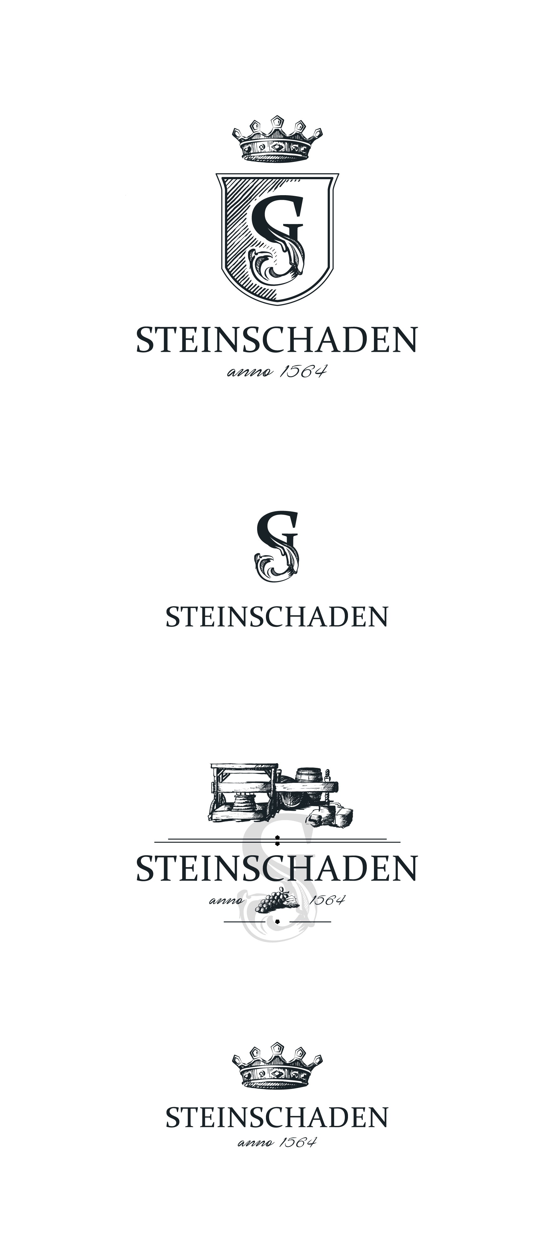
My main idea was to keep the feel and spirit of the old logo as part of a great heritage . So I interpreted the old logo as a new modern one, combining an initial with a vine so that it looks like the S is growing and blooming and living.
A crown - again to remind of the old logo, but with five stones, to represent the 5-sided stone that is the cross-point of the five villages and the place where the wine is made.
I also did some variations of complementary graphics, that can form the whole brand look and feel.
All hand-drawings.