Logo idea for a kitchenware company

0
Created on 99designs by Vista
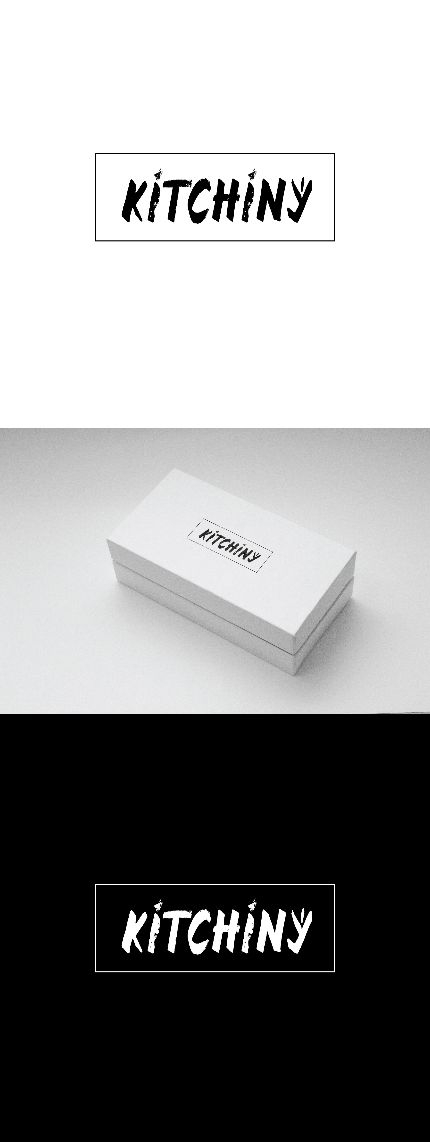
This is a hand made lettering, that looks rough. I give it a small tilt to make it more dynamic. In it there are a knife and a fork symbols, but are delicately hidden, just as a hint to kitchen ware, but not so obvious to be the main thing that a customer sees in the name and logo. I oppose to the rough look of the letters a fine and elegant smooth frame to finish the whole logo.