Straight-Up Disability Support

52
Created on 99designs by Vista
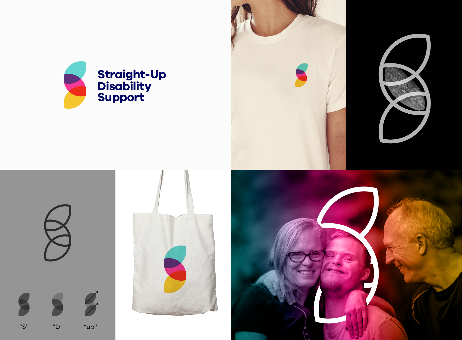
Visual identity for a non-profit supporting people with disability.
Three vertically linked figures, inspired from ancient Aboriginal shield, represent “the straight-up solidarity relationship”. The overall shape is obviously “S”, but it also has “D” and subtly indicates “up”.
The interesting fact is that it looks same even if it is turned 180° (except color), which represents equal relationship from both sides.