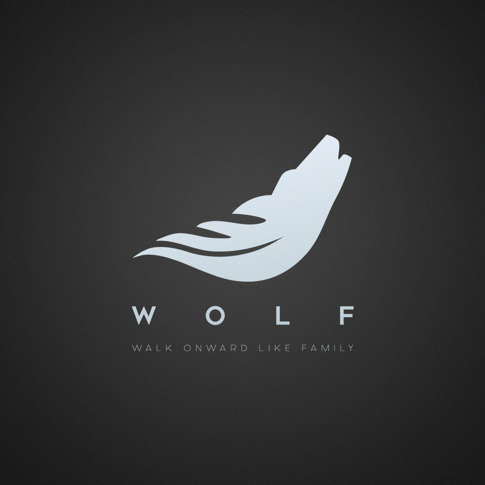
Combination of a Wolf and a Leather
8
Created on 99designs by Vista
A combination of a quiff, (also the logo of the institution in which the project is based) and a wolf. I aimed for the perfect flow of the transfer from one element to another in order for the concept to feel and look as a whole. I made the logo simple and clean as I figured that the owner would want it printed on a various range of media, including posters and clothing. The lack of unnecessary detail allows the company to use the logo in a smaller size and not loose from quality and clearness.
