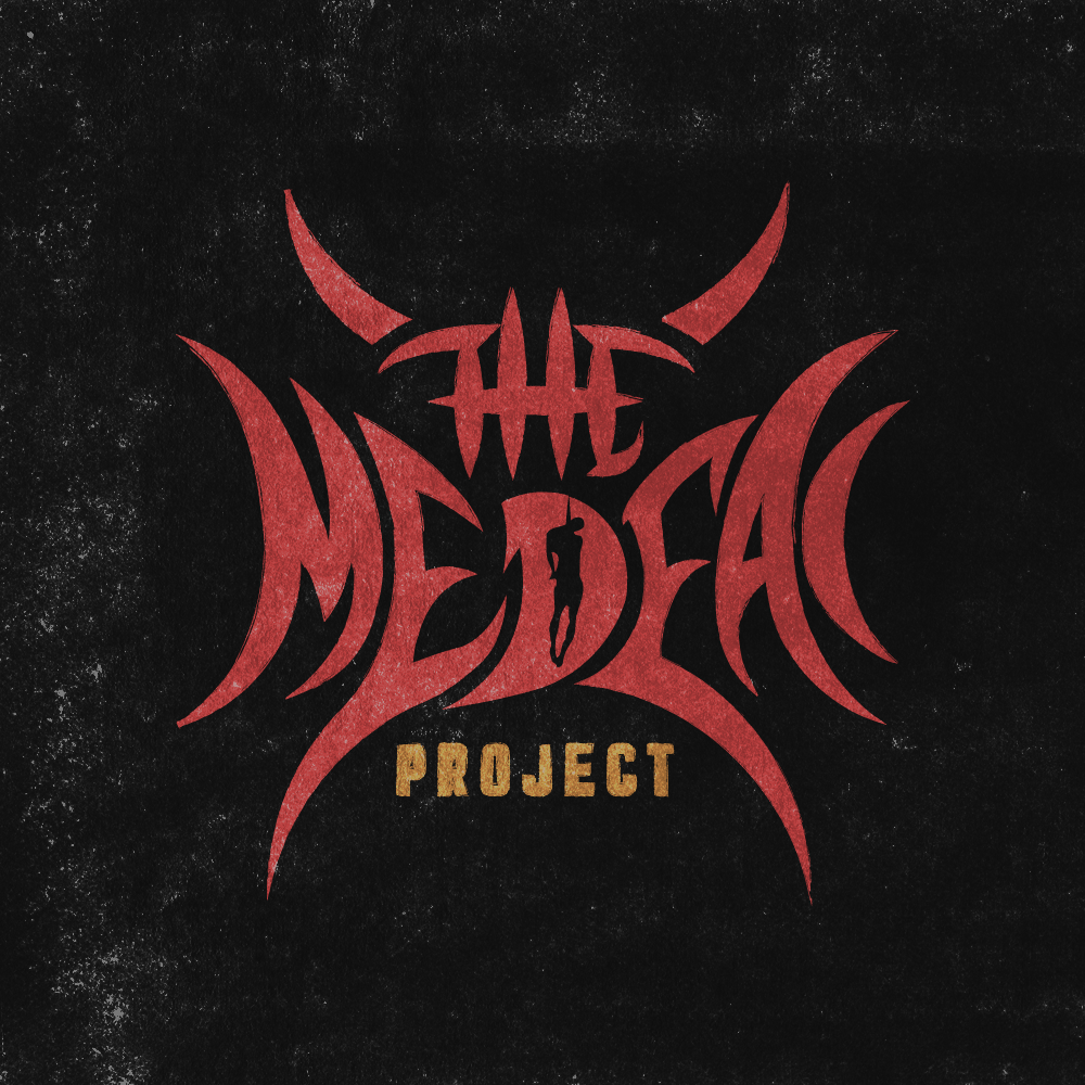
Created on 99designs by Vista
The CH stated in the brief that they would like a recreation of their old logo, which was a circle with 4 horns. I decided to modernise it and create a custom font that would match the music they are playing and the industry they work in. After doing some research, and based on my music band logo experience, I went for a symmetric logo design, with a shape of a hanging man as requested by the CH. I chose a colour palette that would create an atmosphere of doom and horror, and, using Adobe Photoshop added a grungy texture that finished the look. In the end, the logo resembled the old symbol that they had plus their name symetrically incorporated in it.
