Clean Logo for Job Recruiting Company

2
Created on 99designs by Vista
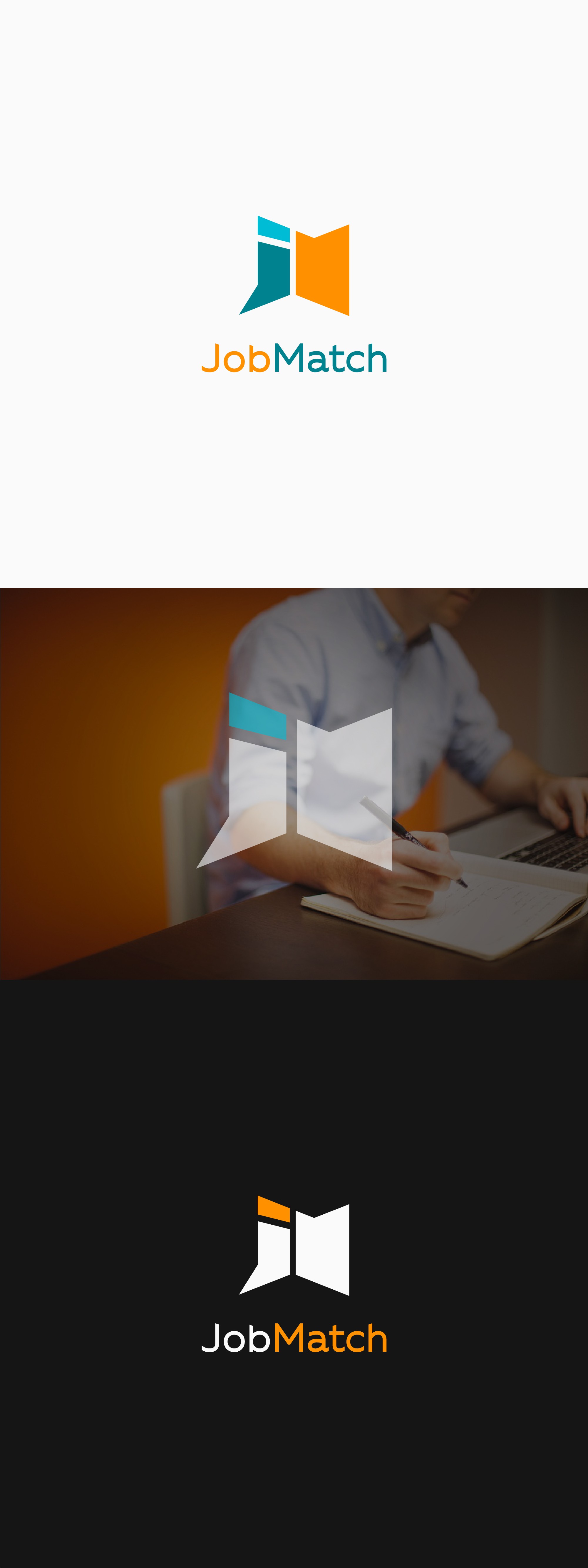
My concept for this logo, was to make a suggestion of the old job-finding methods (newspaper/talking), as a suggestion of a company that respects the past, and develops these services into the future.
Thus I designed this subtle icon, the geometry of which makes an analogy to reading a newspaper, or conversing, in order to find a job.
The slight assymetry (top vs bottom), help the letters form, but also make a suggestion for a bold company.