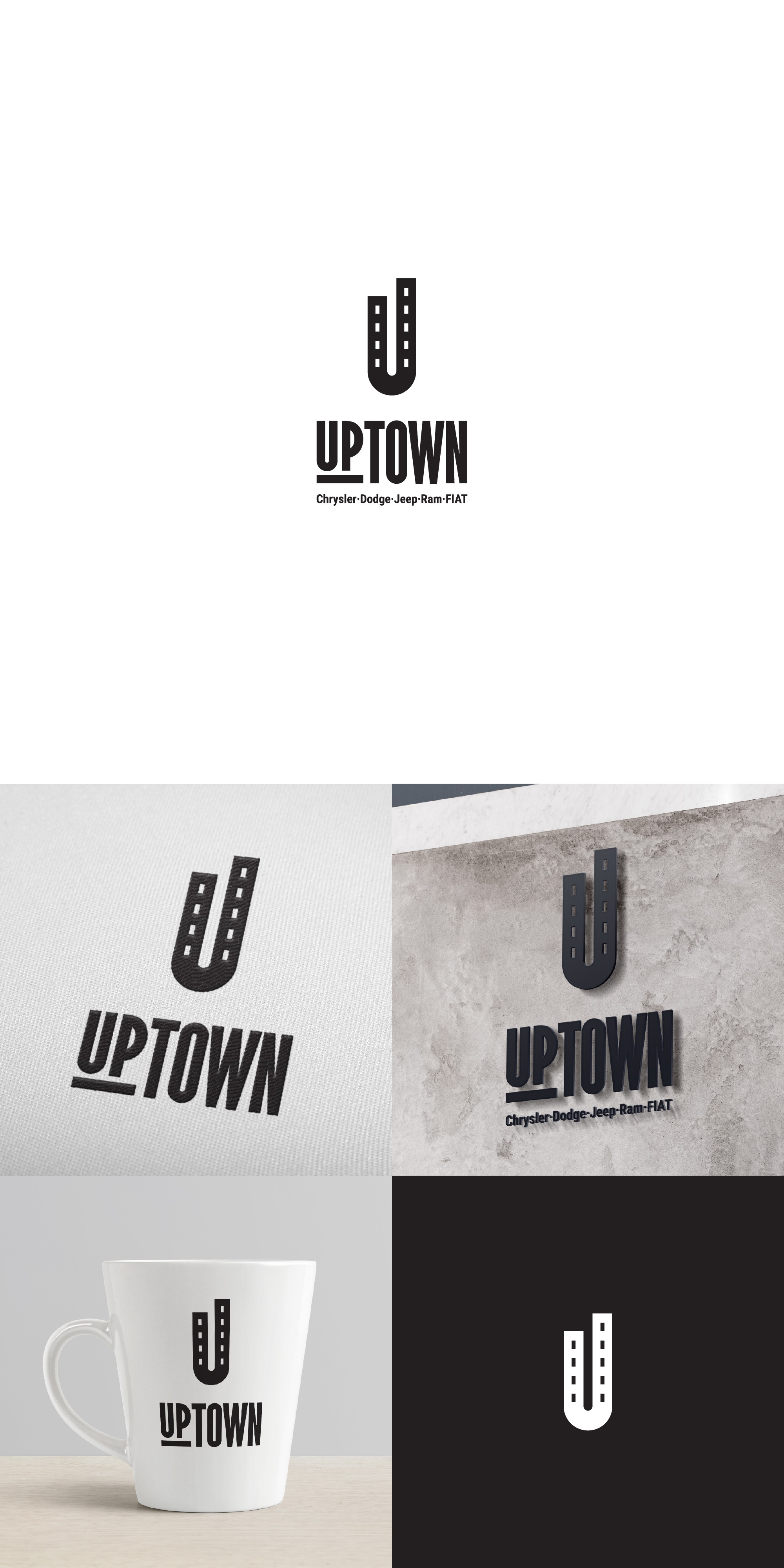
Fresh & Trendy logo for an uptown car dealership.

3
Created on 99designs by Vista
My goal for this brand was to keep it loud and fresh, make it stand out from the competition, and appeal to a new-age buyer group.
The initial "U" poses as buildings/minimal skyline while also doubling as a bird's eye view of a street, conveying both the message of the brand name, but also a hint of the services.
The overall design is kept high and narrow, to convey a sense of strength, youth, and vibrancy.