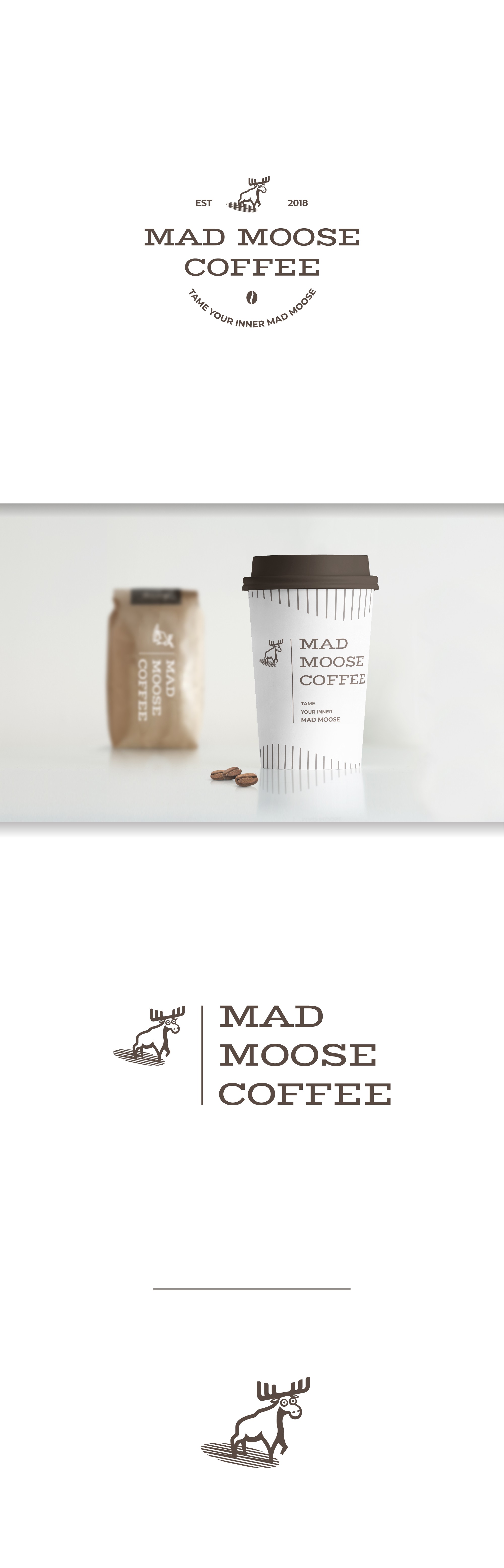
Vintage looking logo for Mad Moose Coffee

3
Created on 99designs by Vista
My goal for this logo was to create a vintage feel for the brand, keeping it mainly typographic, and adding only a few graphic elements.
A splash of fun was added drawing the moose as startled as it is.
Having in mind the many product applications of a coffee-shop brand, I designed a few lockups, so each may find its place on different packaging.