Forge entertainment group logo

2
Created on 99designs by Vista
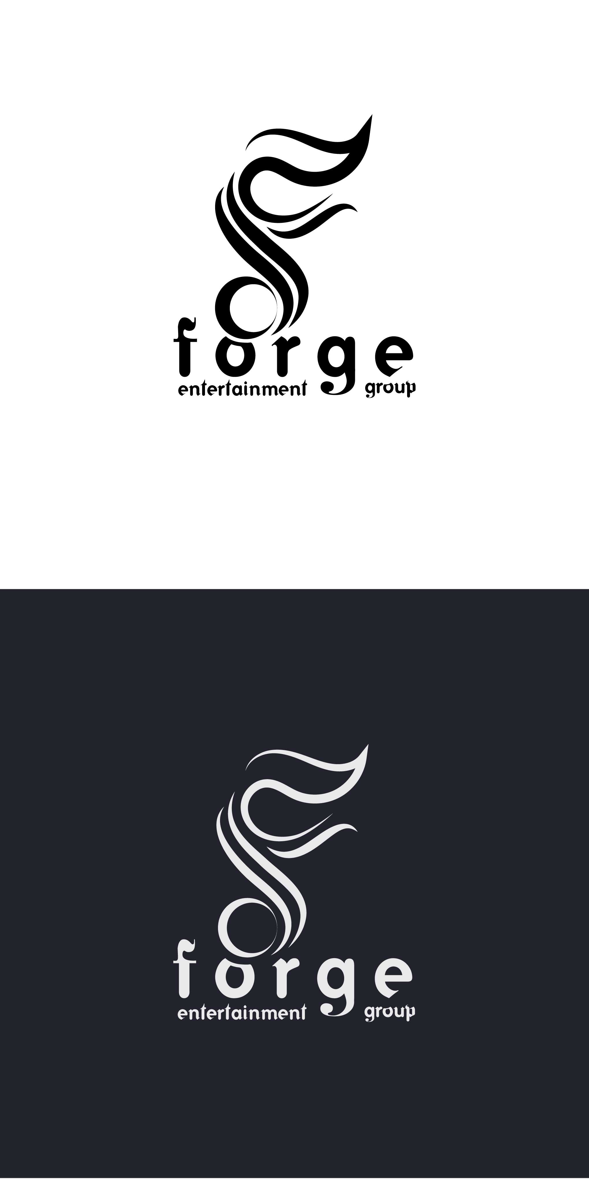
I started this design with the lettering. Using just a series of strokes I created the stylized letter "F." It's abstract in general but alludes to flames used forging in a fire. It also loosely resembles a 16th note. For the word-mark, I choose a type that integrated well, picking up both the vague fire and music symbolism with a little flame on the "f" and a serif-like musical glyph on the open-tailed "g." I increased the tracking/spacing between the letters of "forge," placing "entertainment" on one side of the g-tail and "group" on the other. To fix the Irradiation phenomenon, I decreased the stroke in the inverted version so that it matched weight optically.