
Created on 99designs by Vista
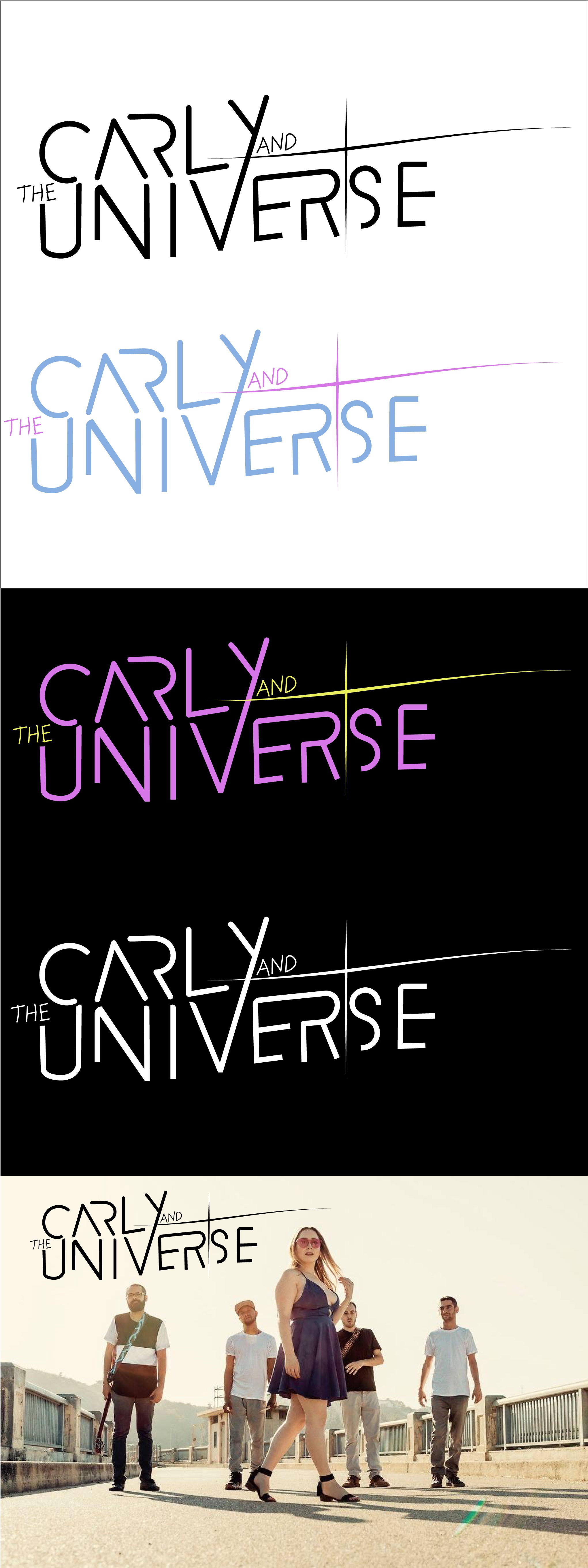
I started with the wordmark design by focusing on creating something including all of the elements mentioned in your brief. The first thing I came up with was a cropped typeface that joined both "Carly" and "Universe." I wanted the letters to have geometry and have some feminism to it. So I rounded the letters in Carly's name and kept the universe sqare to add some contrast. I created the words on a rise then added the handwritten catchwords and a starburst that also works as a plus sign. The final steps were to add the 90s colors to work, which, along with the cropped text, gives a very modern and trendy LA feel to the whole wordmark logo.