Acosta & Acosta Custom Wood Windows and Doors, LLC.

5
Created on 99designs by Vista
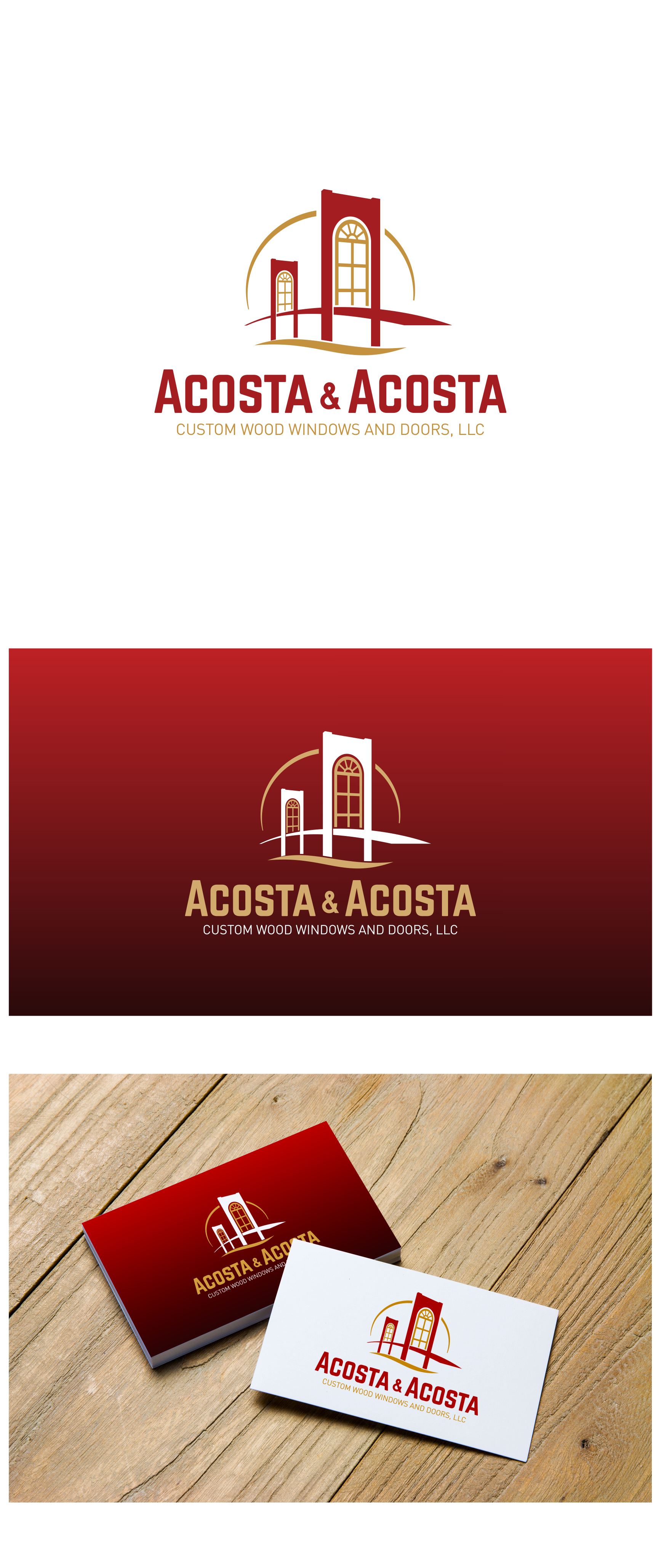
This logo is trying to explore the initials of the company name (AA), the local characters (San Francisco, California), and the business fields of company (woodworking, mainly windows).
The result of the logo is a viewpoint of the golden gate bridge that can at once accommodate the double letters of A, as well as with a literally window inside.
The addition of the accents of the sun's curves also wave shapes of water gives the logo a more lively impression.