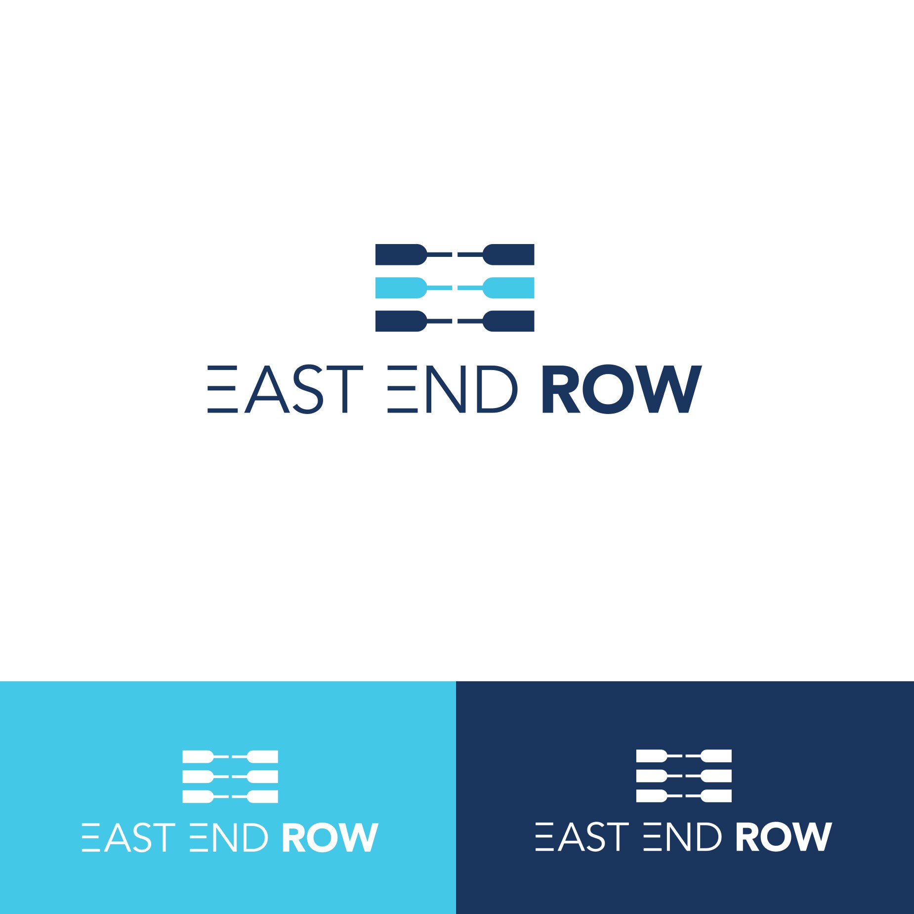
Winning logo designed for a rowing-based fitness studio in Long Island, NY. [May 2016]

28
Created on 99designs by Vista
The image combines the use of three rows to form a letter “E” for East and End letting the “R” self-explanatory with the three rows ("Row" highlighted/thicker as well). The three rows are divided in the center to better distinguish both letters “E.”