Search engine landing page and results page

2
Created on 99designs by Vista
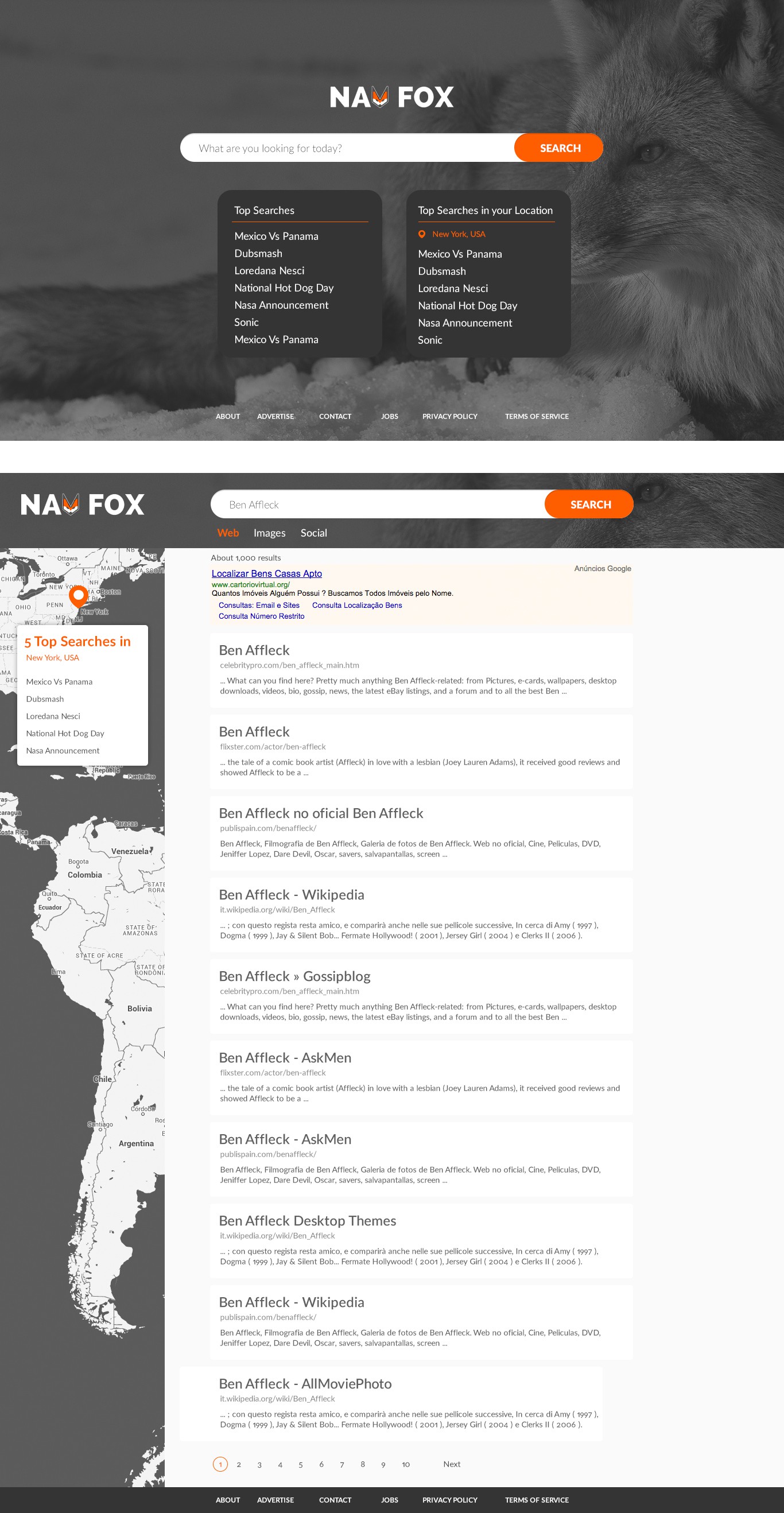
I've designed a sleek and modern landing page, with a big fox picture that's still elegant and subtle due to the grey overlay. Also, I've reduced the color palette of the website to match my minimal approach, keeping the brand's bright orange.
The results page aims toward a more modern and less google-ish design, with bigger titles, slightly grey background and rounded-corner white boxes. Again, keeping the colour palette very simple and monochromatic, using the orange on the active links. This design manages the hierarchy of the results very well by using different font sizes and shades of dark grey.