
Created on 99designs by Vista
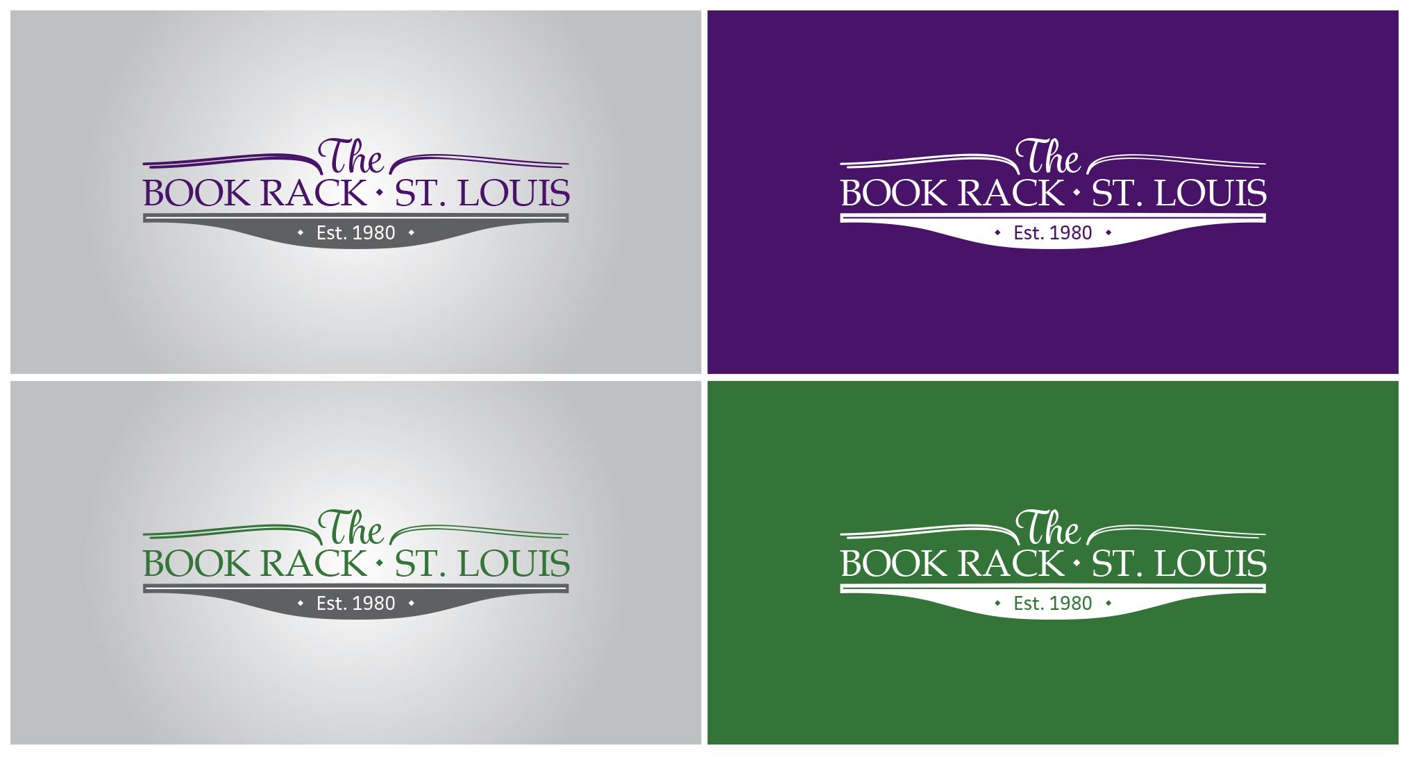
The logo shows 3 different lines with different fonts as suggested by the client. The first line is an abstraction of an open book with 'the' in the middle; the second line showcase the name of the bookstore; the third line is supporting the whole logotype and is representing the Book Rack with 'EST. 1980' in the middle.
The main typography in 'Book Rack, St. Louis' has been selected to be simple, luxurious, classic and mature, it is also easy to read. The scrip font at the top and the sans serif at the bottom are Classic and Mature, the top one grabs the attention to the logo, while the sans serif at the bottom is perfect to give a solid statement like the year on where the business was established.