
Created on 99designs by Vista
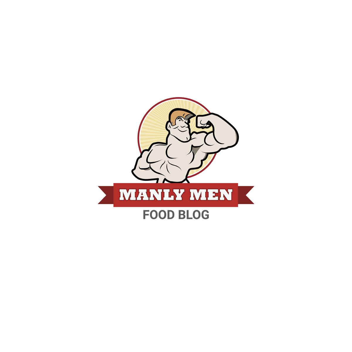
The CH wanted something stereotypical and not too serious. He also wanted to avoid the usual hipster version of manliness. I chose to use a body builder, with a slightly cartoonish style. The fonts are bold and strong, very manly!
The 'Food Blog' part needed to be easily removed from the rest of the design as the logo will be used for other things.