Logo for wine and food shop

12
Created on 99designs by Vista
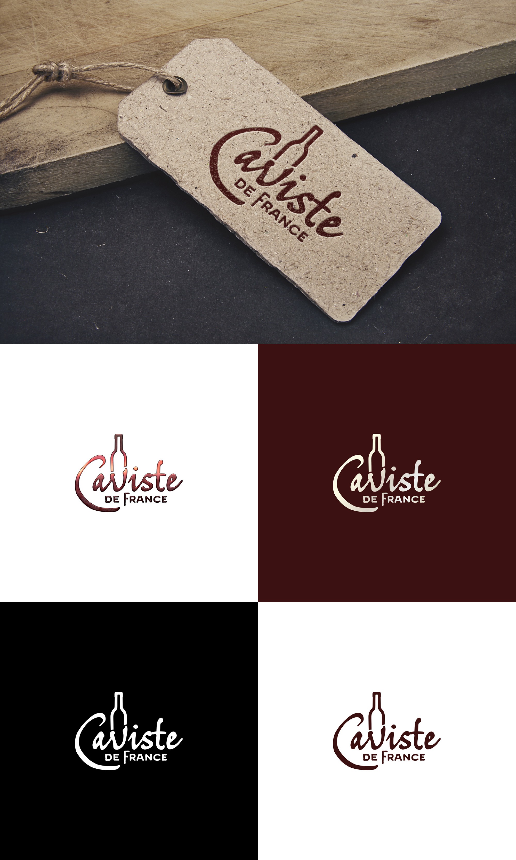
Client wanted a logo for his French wine shop (he also sells wine paraphernalia and fine foods).
Merged the "v" with a wine bottle shape. Simple but effective. The main font is heavily edited from the original so it's reasonably unique.
I was aiming at a slightly rustic style, more rural France than urban.