a powerful, modern, JAPANESE-INSPIRED logo for a creative marketing agency

38
Created on 99designs by Vista
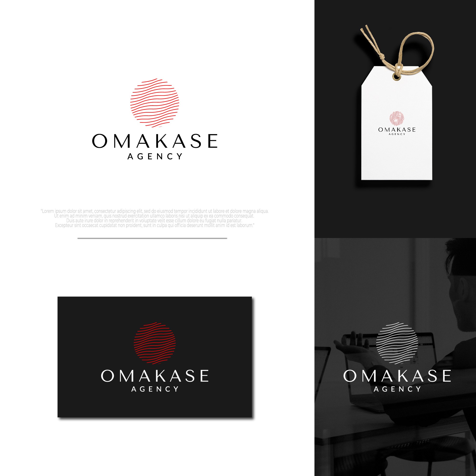
- The logo is the letter 'O' which is represented by an artistic look (shaped like a flag flying).
- The letter 'O' in the logo illustrates the initials of the agency name - 'Omakase Agency'.
- The letter 'O' which is represented by an artistic look (shaped like a flag flying) illustrates the meaning of 'strategy, creative, and execution of impactful marketing services', this makes the logo suitable to represent the agency which is 'a digital marketing agency, providing a range of marketing services, with an emphasis on creating thoughtful and artistic content, with the goal of growing the client's business and brand with impactful content and strategic ad campaigns'.