Simple Illustrated Logo in Red for Red Cottage Inc

0
Created on 99designs by Vista
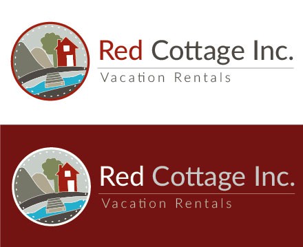
The graphic depicts the characteristics that I researched & found in the area that the company has rental properties in. As well, it ties in the characteristics of a cottage feel. The red building in the image represents the "Red Cottage" portion of the name of the company. There are hills, trees, beach and a deck to forge the image in a cottage-like aspect. The graphic is placed in a circular shape with a stitch-like illusion to create a camp-badge perception.
The typography used is a simple sans-serif font that does not take away from the graphic. The red is characteristically red with the rest of the type in a grey-green-brown colour. All colours are taken from the current website and I believe they work well with the colour red.