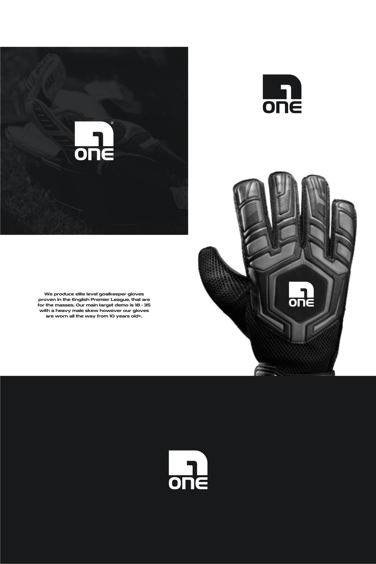
Bold Logo Design for ONE, an already established goalkeeper gloves company

25
Created on 99designs by Vista
This is a rebranding project and one of the specifications was to envision a logo that is in a square format instead of the old rectangular wordmark they've used. A custom created modern font based on the old "ONE" wordmark which was to rigid and "angular", with soft flowing features is accompanied by a logomark, a strong and bold design encompassing a negative space "1" symbol also forming an abstract goalkeeper/glove/hand shape.