Logo Redesign, an edgy minimalist approach on existing logo

47
Created on 99designs by Vista
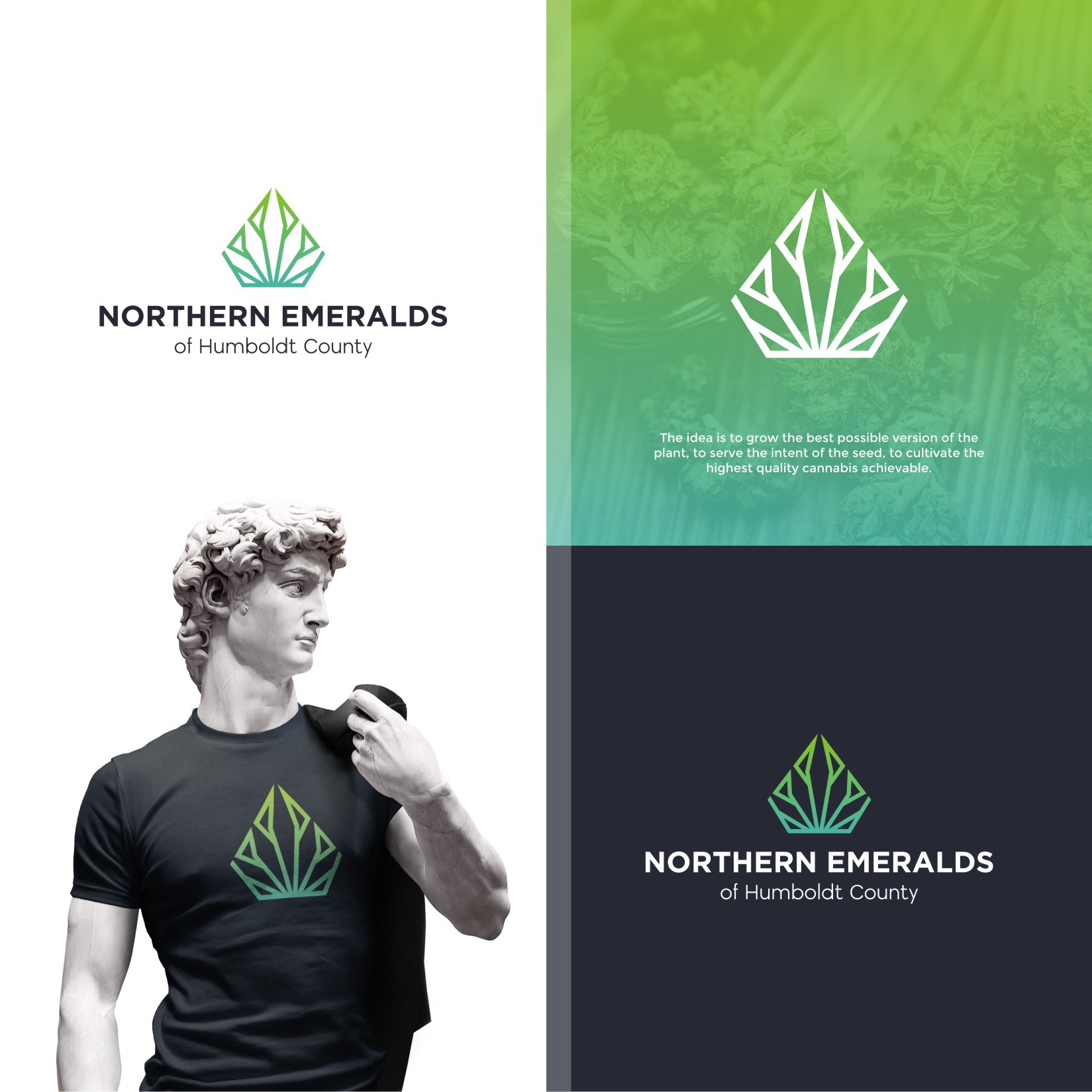
The original logo design had the diamond shape and the geometric angular leaf shape in a slightly different format. As they are already a well know brand they mentioned that the original logo should be still present. I've re-done some angles and line trajectories for a more symetrical look and also introduced a more modern edgy feel to it by using a negative space technique. I just love the end result and really can envision the symbol as a timelss atractive brand that really catches your eye while still maintaing a clean simplicity feel to it.