Cool "sciencey" logo for HEMP Solutions, LLC

71
Created on 99designs by Vista
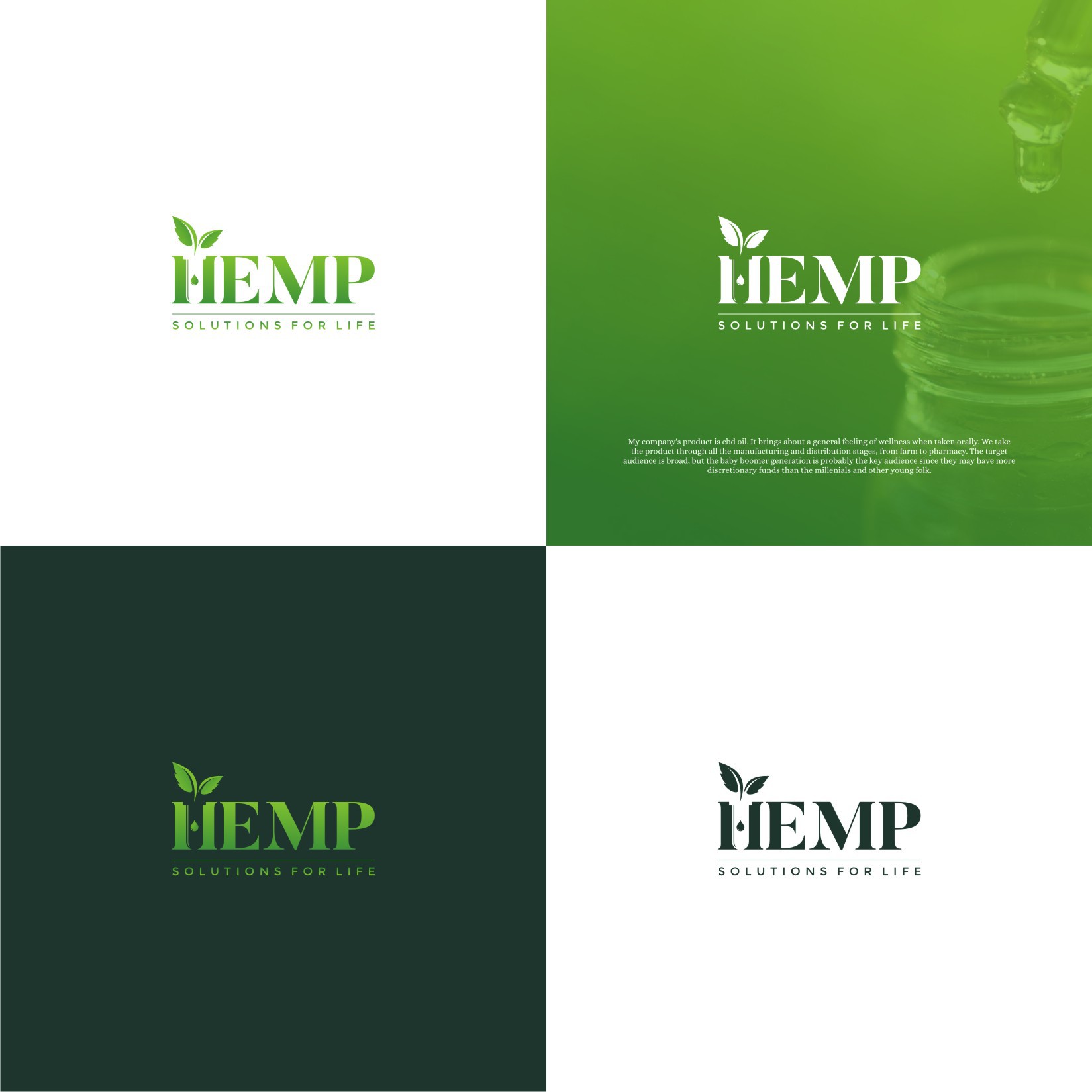
This was a special project. Client noticed my initial entry of this concept and selected me among the finalists. We started working on refining it as the simplicity of the word-mark with the negative space beaker integrated in the H letter is just amazing. Droplet instead of the H horizontal bar and the abstract hemp leaves just completed the picture perfectly. Had another logo selected winner here as the client really loved my style and asked for a very specific cross designs with an apparently generic look but with very special meaning to it and an awesome philosophy behind. Really enjoyed the project and hope we'll have some more work done together in the future :)