Bold with that "wow" effect logo proposal for lawyers who represent cannabis businesses

28
Created on 99designs by Vista
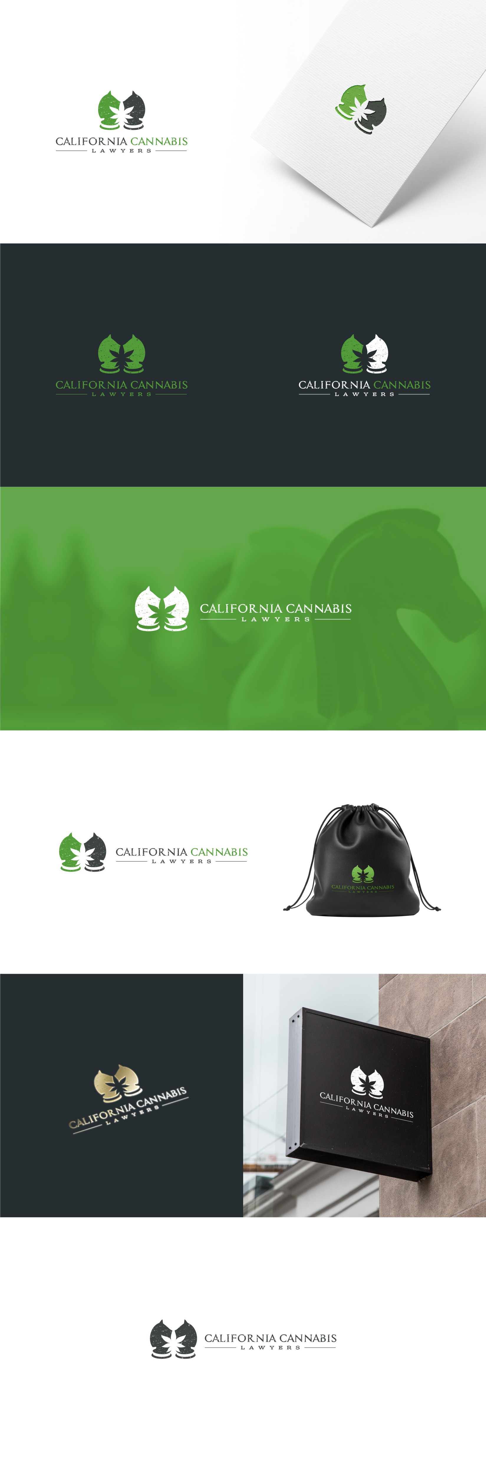
Client demanded that the knight piece should be the main part of the logo so immediately I saw the negative space potential for inserting a leaf in the design. The opposing knights was the details that made me love this concept. Unfortunately the client went the other way.