
Created on 99designs by Vista
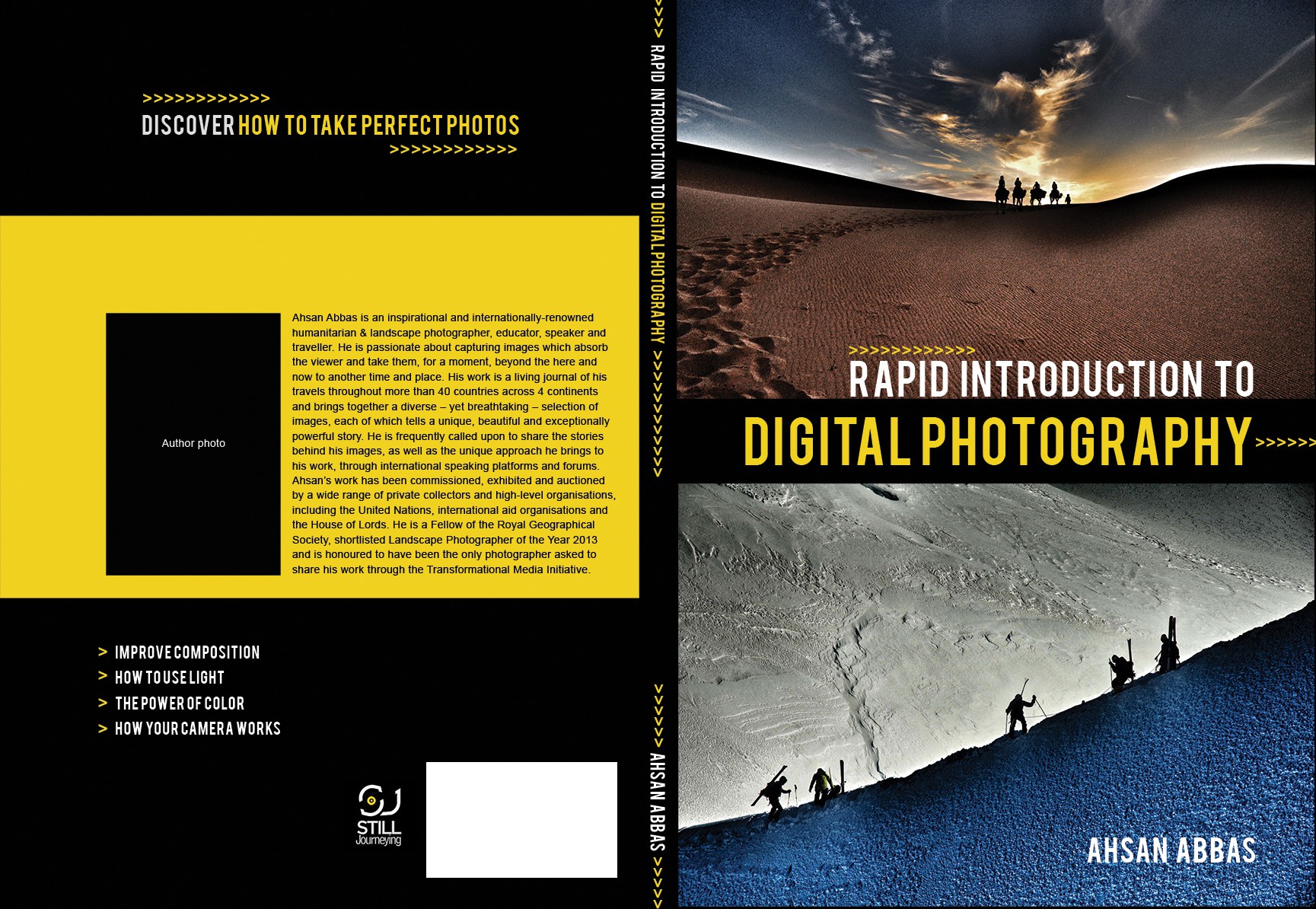
This cover is minimal open and clean to put all of the focus on the photography. The two images chosen work well together because they have a similar concept in line and silhouette but also have contrast with one warm and one cool color. The font has a technological feel and is bold and easy to read in all caps. A repeating arrow element adds a graphic that can be used throughout the cover to create the feeling of a brand. It also illustrates the concept of movement, travel and repetition which are all necessary elements in this particular aspect of photography.