HAMSA, primer cream, box and tube design

15
Created on 99designs by Vista
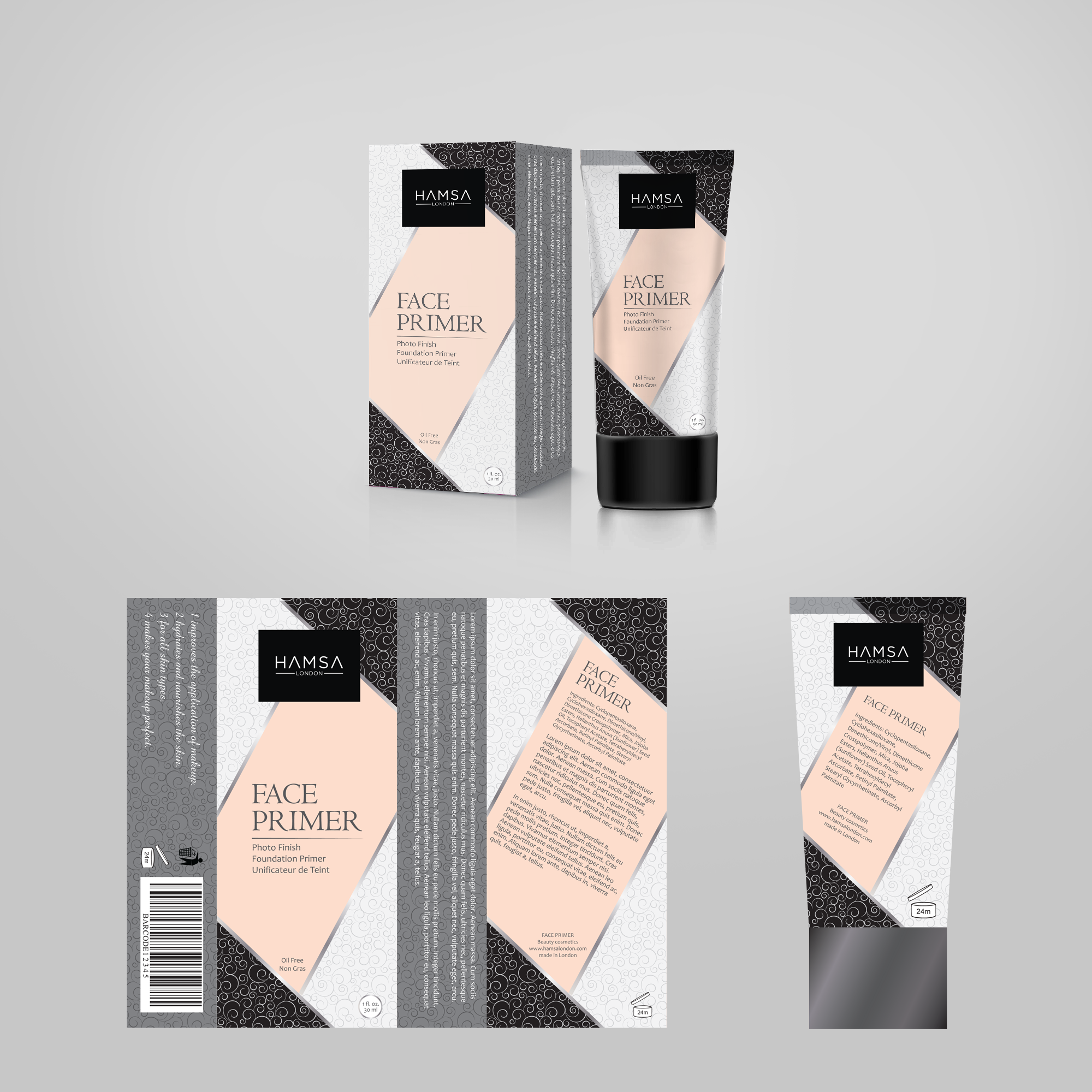
There are a lot of limitations when the design for the cosmetics is on creation.
Usually it is not suitable to use photos and other traditional attractive elements here.
Also the market is full with the competitors so standing out is a difficult task. And, of course the design should be clean and stylish to fit all the positioning points.
For Hamsa primer tube and box packaging design we decided to use diagonal composition for central text banner and other design units to give unusual and attractive look to overall visual structure.
Well balanced and non-bold colors were also chosen to complete the layout.