Luxury Yachting Service - Serenity, Relaxation, Adventure, and Fun!

10
Created on 99designs by Vista
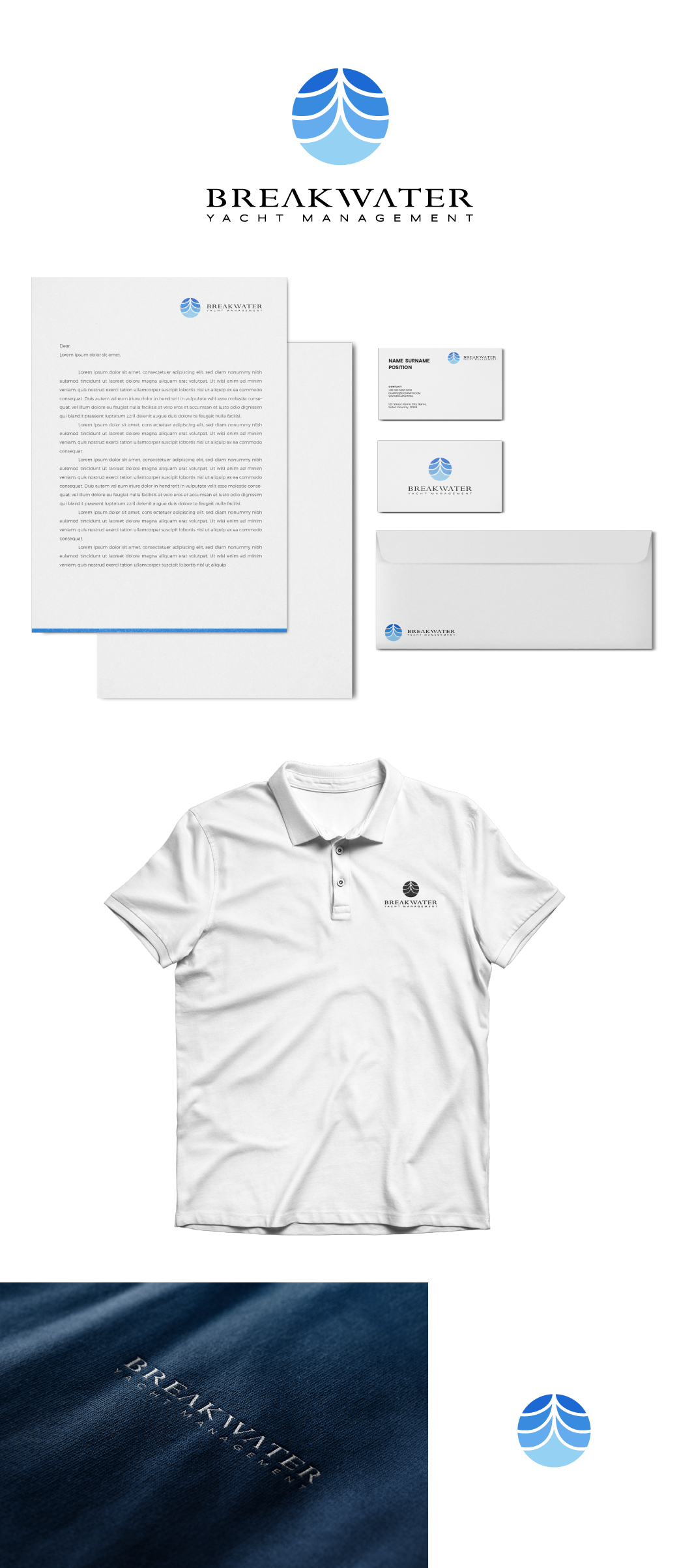
Basically the concept that I created is an illustration of a breakwater, water coming in the middle.
The upward direction of the breaker also resembles the shape of the front of the ship which has an adventurous meaning.
This logo has 4 spaced blue colors, meaning serenity, relaxation. Color spacing will also make it easier for printing needs. And also if the client wants monocolor, it certainly won't eliminate the meaning of the logo itself.