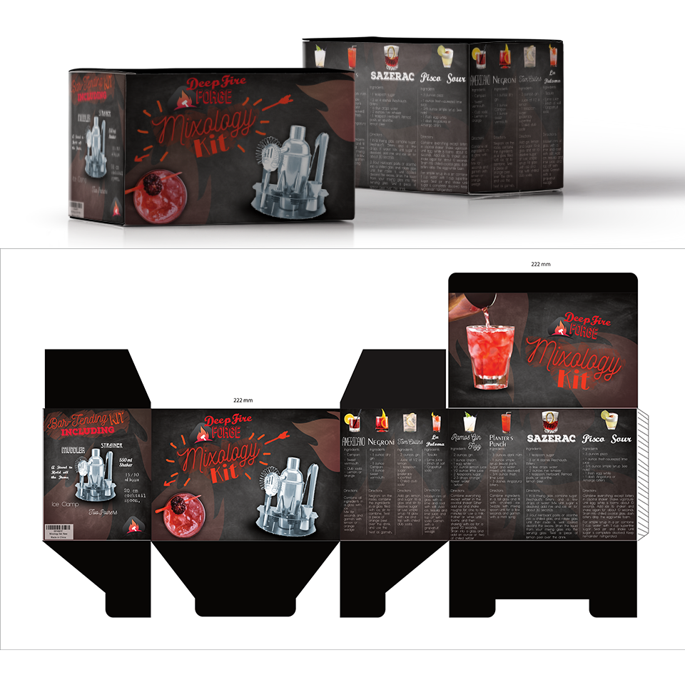
Luxury Packaging for Mixology Set

20
Created on 99designs by Vista
I used a red and black colour scheme beacuse it gives the packaging a modern and luxurious look. The chalkboard background and used a variety of fonts to create handcrafted kind of aesthetic appearing as though it could be a menu board at a modern bar. The front and left are dedicated to the product and the rear and right are dedictaed to the recipes allowing for large vareity of information to be conveyed without being too busy.