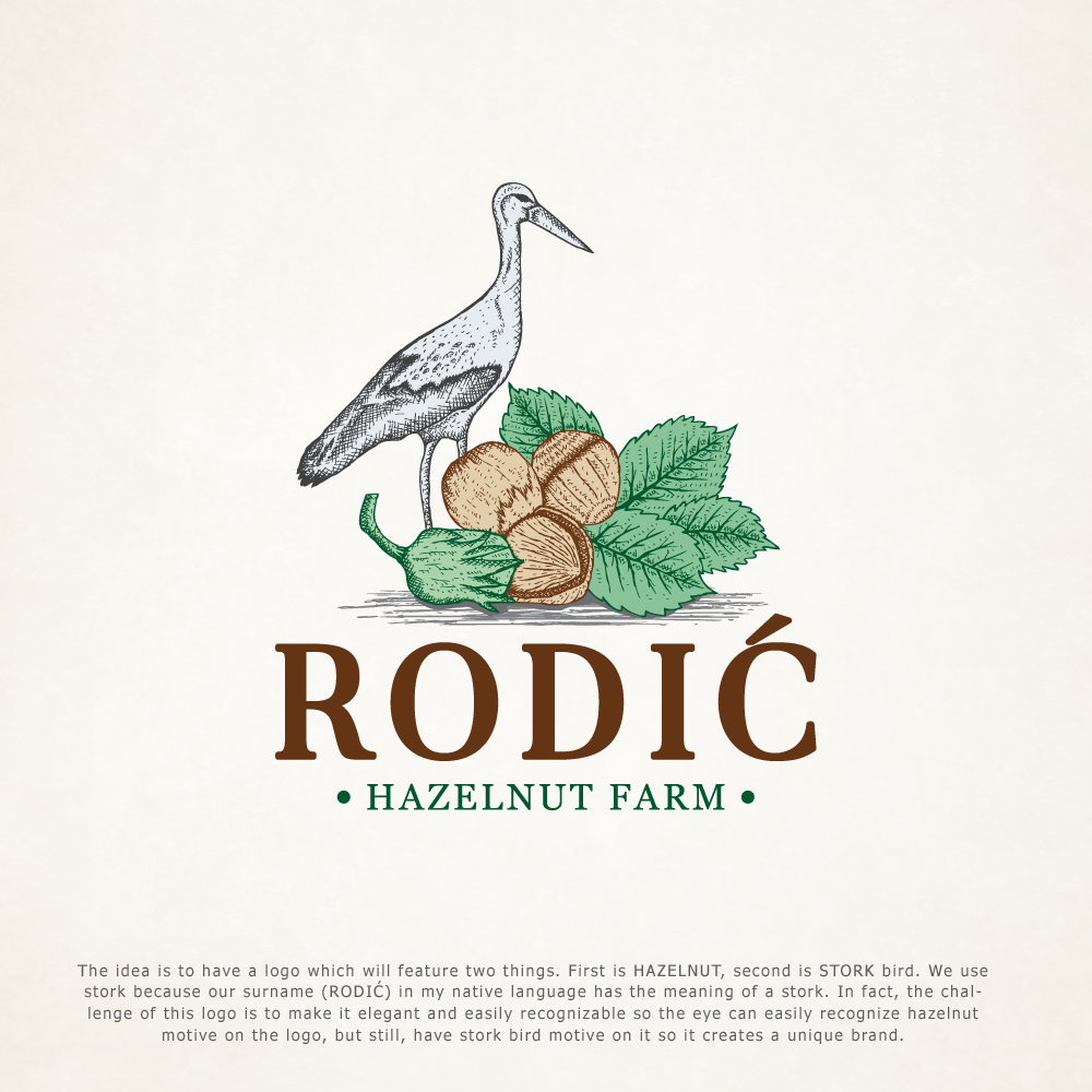
Hazelnut Farm RODIĆ is looking for elegant logo design
13
Created on 99designs by Vista
The idea is to have a logo which will feature two things. First is HAZELNUT, second is STORK bird. We use stork because our surname (RODIĆ) in my native language has the meaning of a stork. In fact, the challenge of this logo is to make it elegant and easily recognizable so the eye can easily recognize hazelnut motive on the logo, but still, have stork bird motive on it so it creates a unique brand.
