
Created on 99designs by Vista
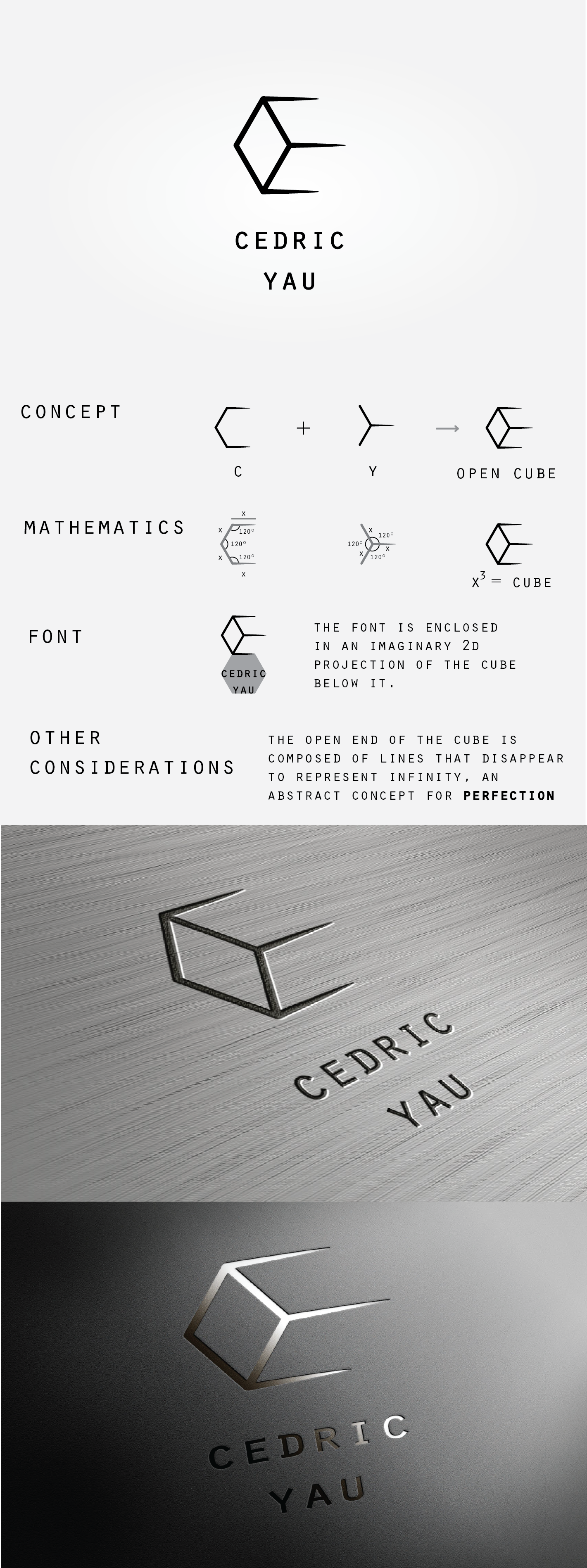
the client's loved cube form is the core of the concept: it is the result of the combination of the letters "C" and "Y" that have been designed following precise mathematic rules. Even the font has been placed within the boundary of an imaginary 2d projection of the cube