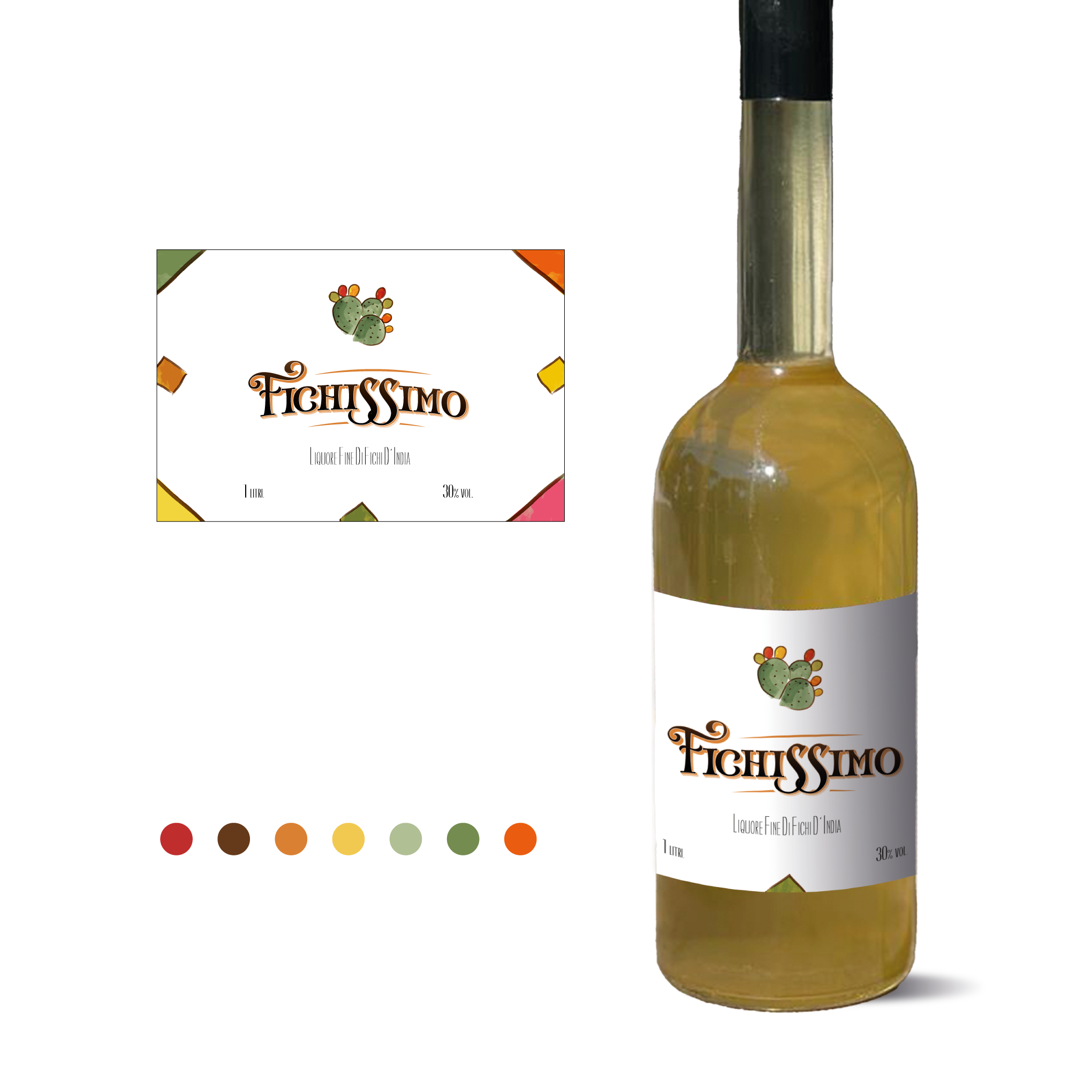

This label is inspired by Sicilian ceramics, the folk painting style and the color palette of the handicrafts. The artwork is created by me.
I looked for an anchorage with the regional, and also with the artisanal, which is the way the liqueur is made.
The prickly pear is an emblem of the region, since many products are obtained from this fruit, besides the fact that it has many beneficial characteristics such as its nutritional properties and the possibility of being cultivated in extreme situations of temperature and water scarcity.
My idea was to promote a fresh and young product, focused on a new generation eager for unique and distinguished flavors.
The gestural character of the art is contrasted with an elegant and more classic font, to denote the careful and professional elaboration of the product.