
Created on 99designs by Vista
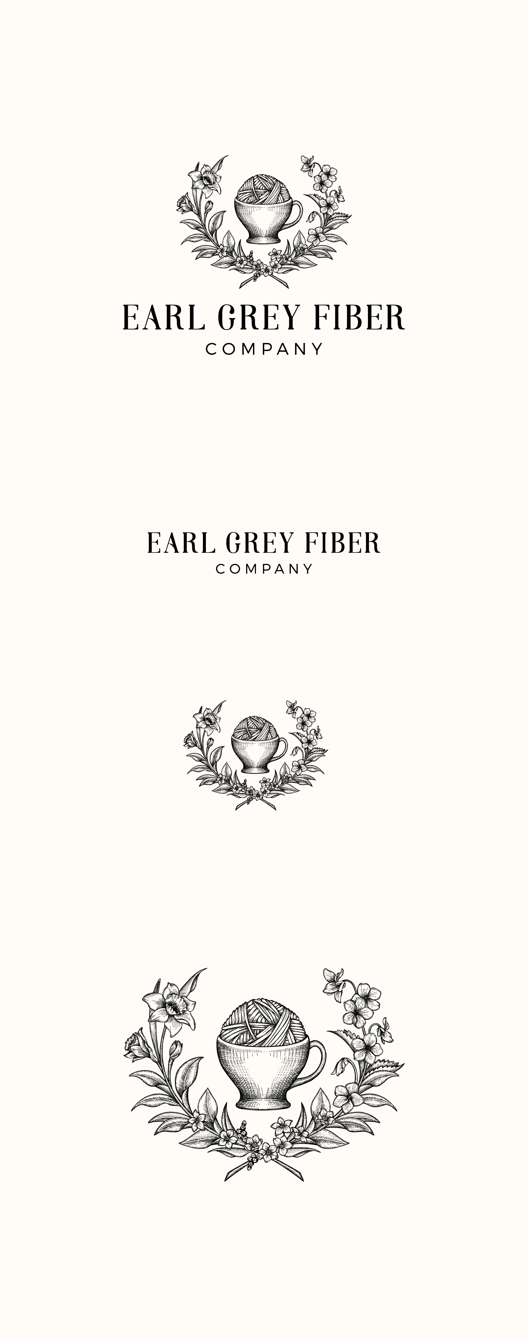
The project was to revamp of an existing logo. The client wanted to fill out the logo and to surround the tea cup with fuller foliage by incorporating tea leaves, daffodils, forget-me-nots and violets. The font has been also changed by more elegant san serif that makes the logo look much more mature and classic.