label for organic black-seed oil

11
Created on 99designs by Vista
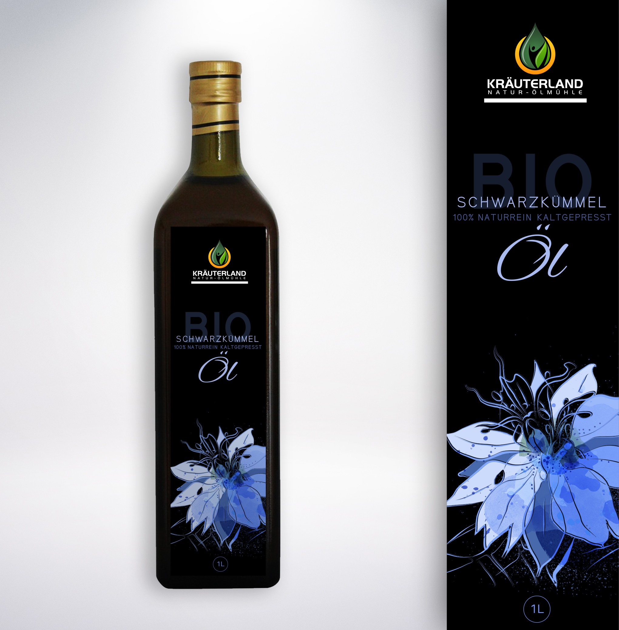
the contest holder asked for redesign of his existing oil label, which was filled up with text and without any flavour picture. since it is a small business with handmade approach on the oil production, i have decided to draw the black seed flower myself, so to accent the unique individual aspect of the brand. the text amount was reduced and i've arranged it in an effect of layers, to achieve the effect of deepness. although the design did not win the contest it made it to the final stage and i personally like it's balanced appearance a lot, as well as the flower
; )