
Created on 99designs by Vista
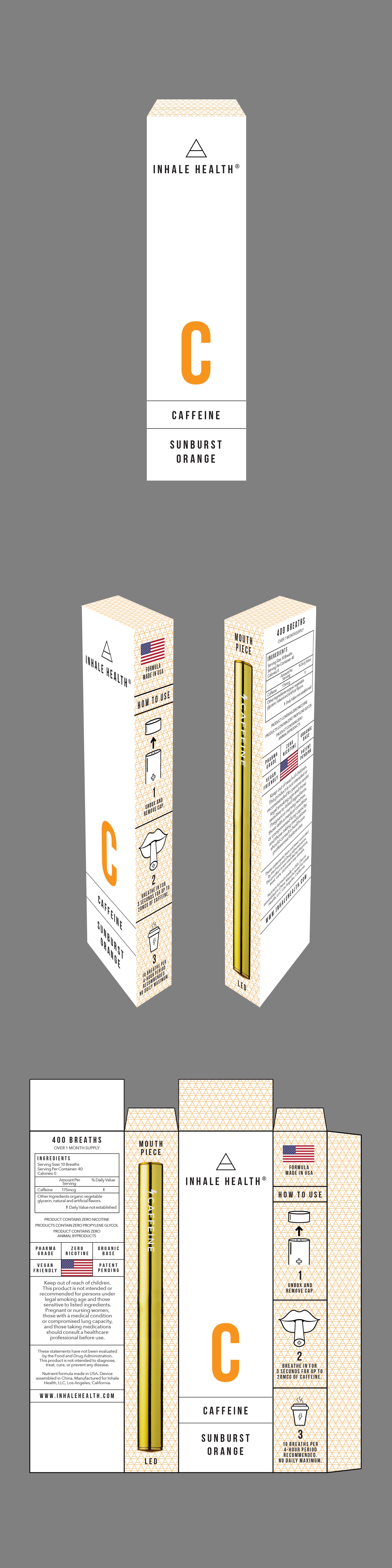
CH was looking for a re-design for their revolutionary project that had a simple, clean design. I chose to go with a simple, almost high-end cosmetic feel. There was not an existing logo, but I liked the idea of using the symbol for Air on all the packages as well as an initial of each product type. A pattern of the Air symbol runs up the sides and top of the package.