Created on 99designs by Vista
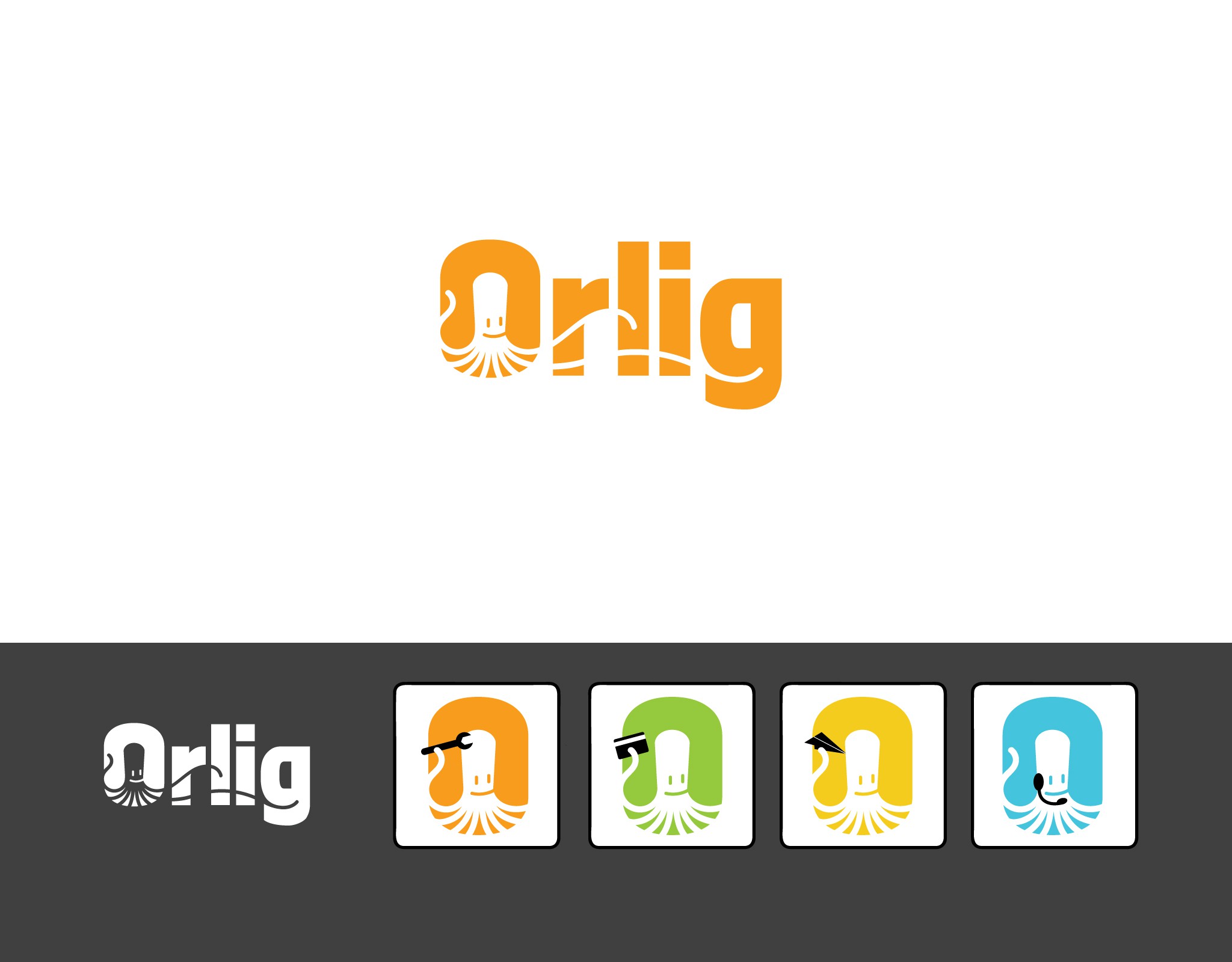
With a name derived from Rörlig (active, mobile, nimble), and with multiple cooperative apps available, I chose an octopus to represent this CRM company. He further suggests technical savvy, creativity, dexterity, and adaptability. The logo lends itself to customization/modification for apps, works on light and dark backgrounds alike, and plays on the mental alliteration of Orange Orlig Octopus. The extended tentacles flow within the typeface’s natural curves, adding a slight grin to the G. Note: since submitting this entry, I’ve removed the smile from the octopus, choosing to give it larger, more inquisitive eyes.
