
The brief:
A service based website providing information, inspiration, encouragement and resources to support adoptive parents. The target audience is parents, primarily women 25-45 years old. The logo should feel full of possibility- calm, uplifting, graceful, grounded, reassuring, and capable. A map/globe.
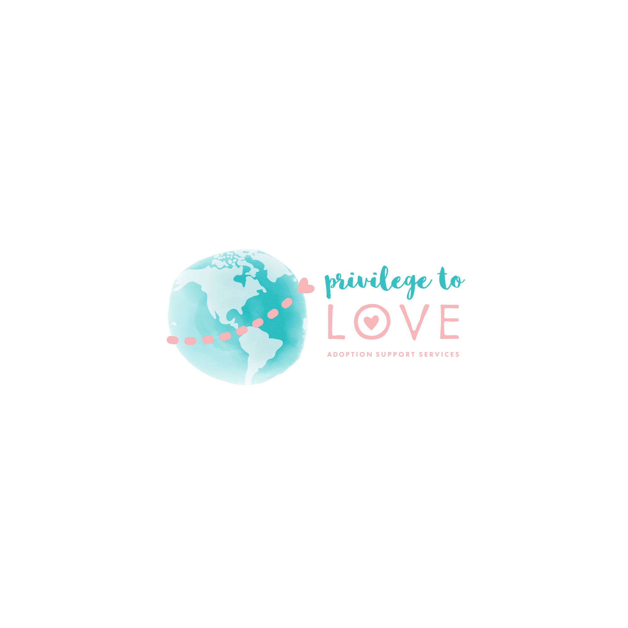
My solution:
The heart making its way across the soft watercolour globe represents to journey that parents and children make together, both in the process of families/children being matched together, and then the journey of getting to know each other and living together. In the words of the client: Where there is love, there is a way.
The hand drawn script gives the design a friendly, upbeat vibe. The simple, san serif keeps it relaxed and stable.