
Created on 99designs by Vista
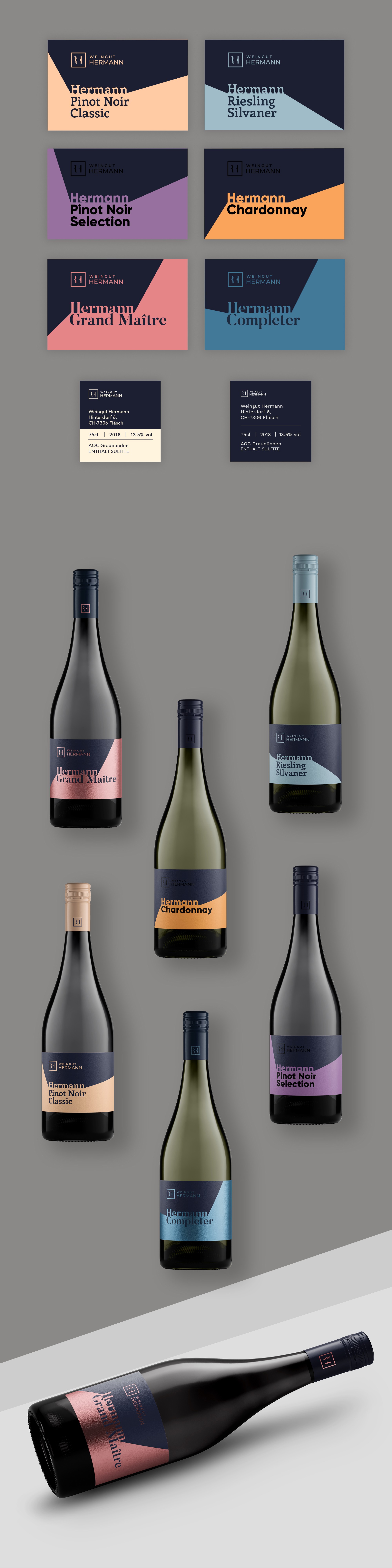
The idea was to use the power of color, fonts and printing techniques to mark different wine sorts in term of quality and price positioning. For the labels of the cheapest wines I use simple sans serif fonts and colors that can be well produced in a cheaper color process, in cmyk (e.g. lighter colors). For the labels of mid-priced wines I use less common font, Pantone colors (more vibrant colors) and spot UV finish on lettering. It looks more sophisticated than the first one. For the most expensive wines I use serif typefaces and a premium hot foil stamp in one color. Capsules are designed to match the price positioning.