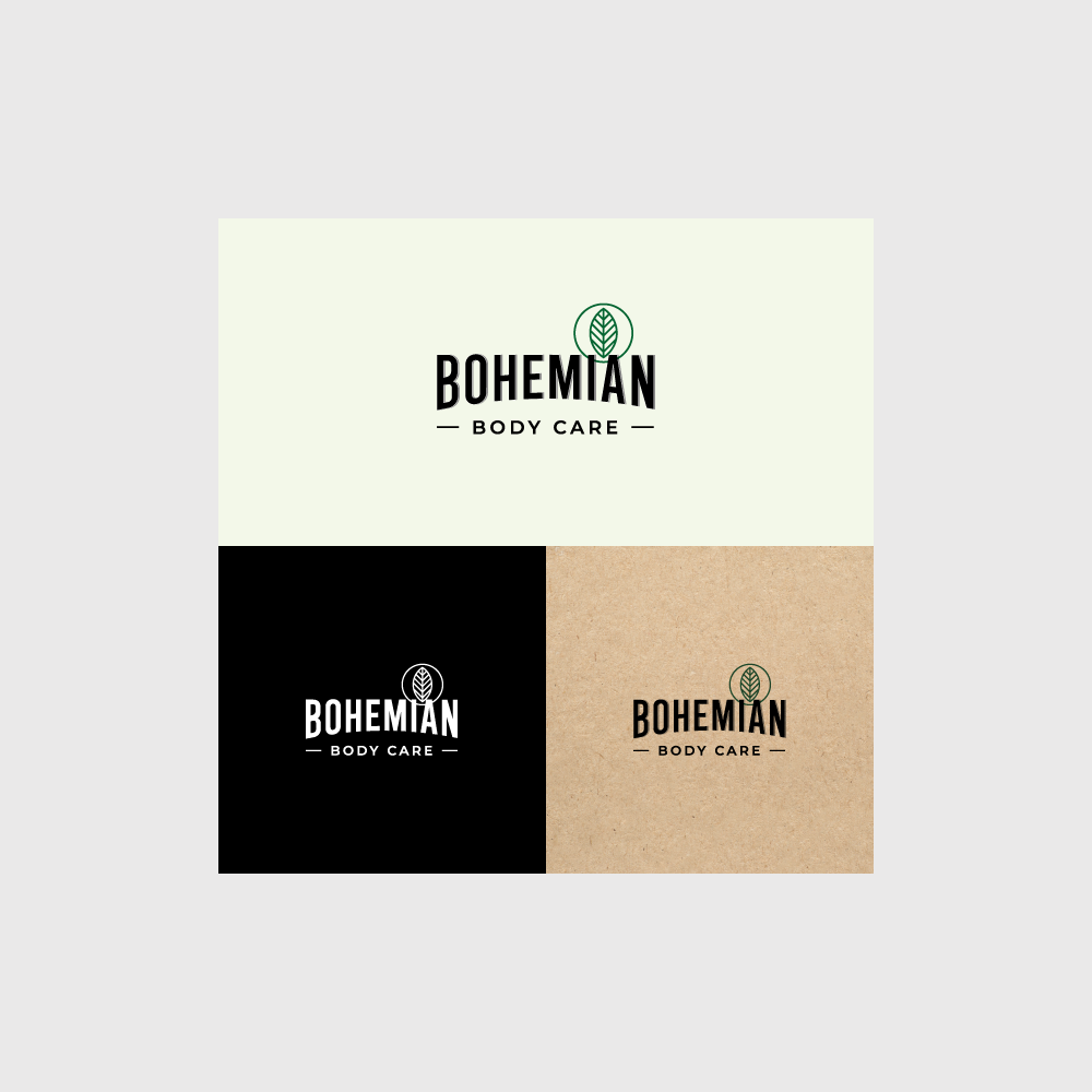
Logo for environmentally conscious beard products

0
Created on 99designs by Vista
The idea was to make a slightly more masculine logo (but not too much, because in future it should function with female cosmetics too) with simple nature element in the form of a stamp. I found the inspiration in retro logotypes, which in my opinion would work well for the target audience. I decided to go with small stamp instead of the bigger illustration because I think that illustration might take over the packaging, especially smaller ones, like beard oil. In that case, every product line would look similar. This way we have a sophisticated logo, which is good for application on packaging because it doesn't have a strong character.