
Created on 99designs by Vista
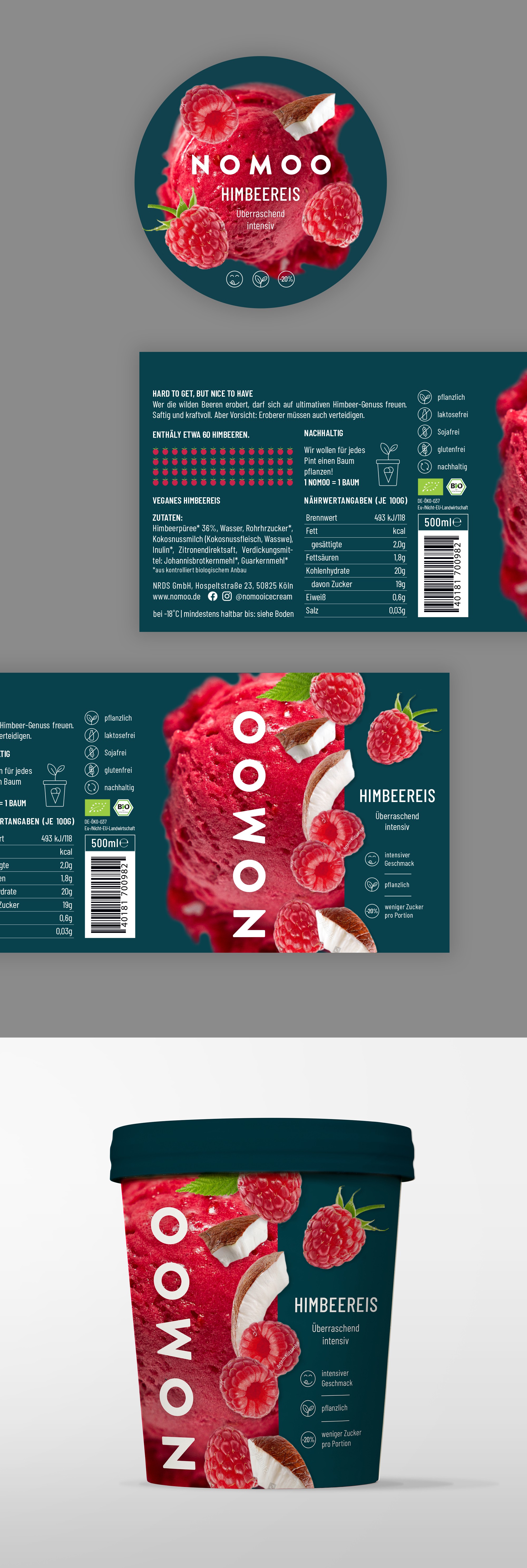
The general design idea was to make a clean and elegant packaging with a little bit of fun. Design is inspired by the strong fruit taste of Nomoo ice cream, so I made a "fruit explosion". When I first saw the color of this ice cream, it was clear to me how delicious it must be, that's why I put a photo of the ice cream texture in the background. Deep green is the color of the brand.