RUNNER UP for: ELITENESS - guide book

0
Created on 99designs by Vista
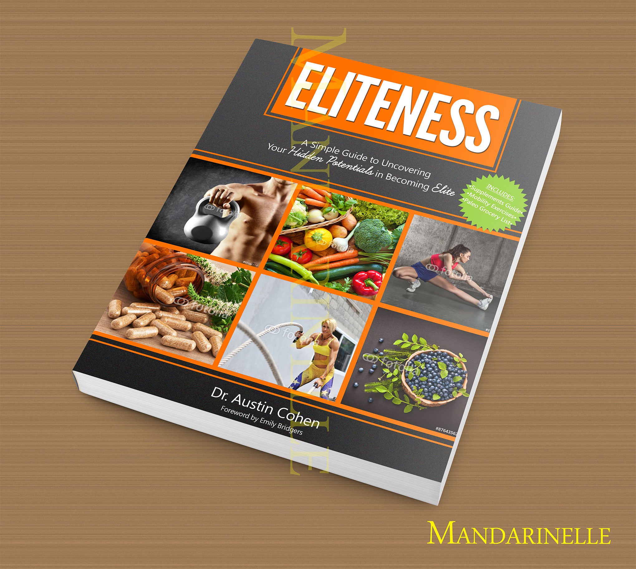
The clean, sleek & slightly-textured grey-black ties into the sense of 'eliteness' as it is sleek and refined. I used images that reflect the different topics that the guide speaks about, so the images reflect cleansing the body and becoming fit & better, becoming Elite. I feel as though this cover makes the book look like the great, educational and intriguing guide that I'm sure it is. The grey-black & orange colours also fit the fitness aspect of the book, since those colours are usually associated with fitness due to them representing hard work and determination. Thanks!