Do work that matters. eBook cover. Character: Meditations on the 13 Principles

0
Created on 99designs by Vista
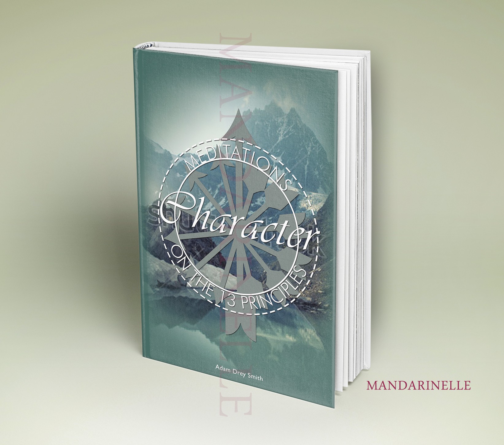
I wanted a calm feel so as to fit with the "Meditations". To give a sense that it is a great reflective book that will help someone to do introspection and become a better person. I also created a crest-type of title, making a more typographical / type-focused cover.
I also added arrows, which, along with their tails add up to 13. I wanted to play on the "13" from the "13 principles" in some way; another interpretation is that I wanted to create a sort of compass, or pathways, with the best pathway being north, the one pointing up, to show that one can live a higher life, "a life they can be proud of". Thanks.