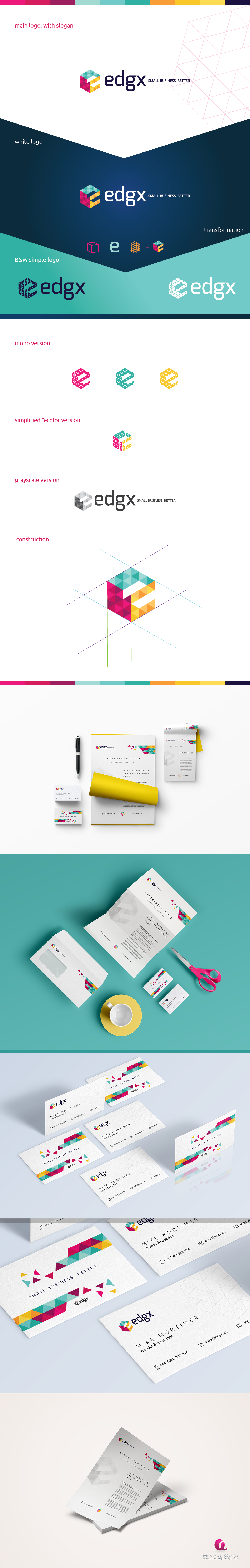
Client wanted a bold and edgy logo and branding for his company, with positive impression and bright colors. The cube cut out letter e speaks for the edge and transformation which were two key words for this brand.