
Created on 99designs by Vista
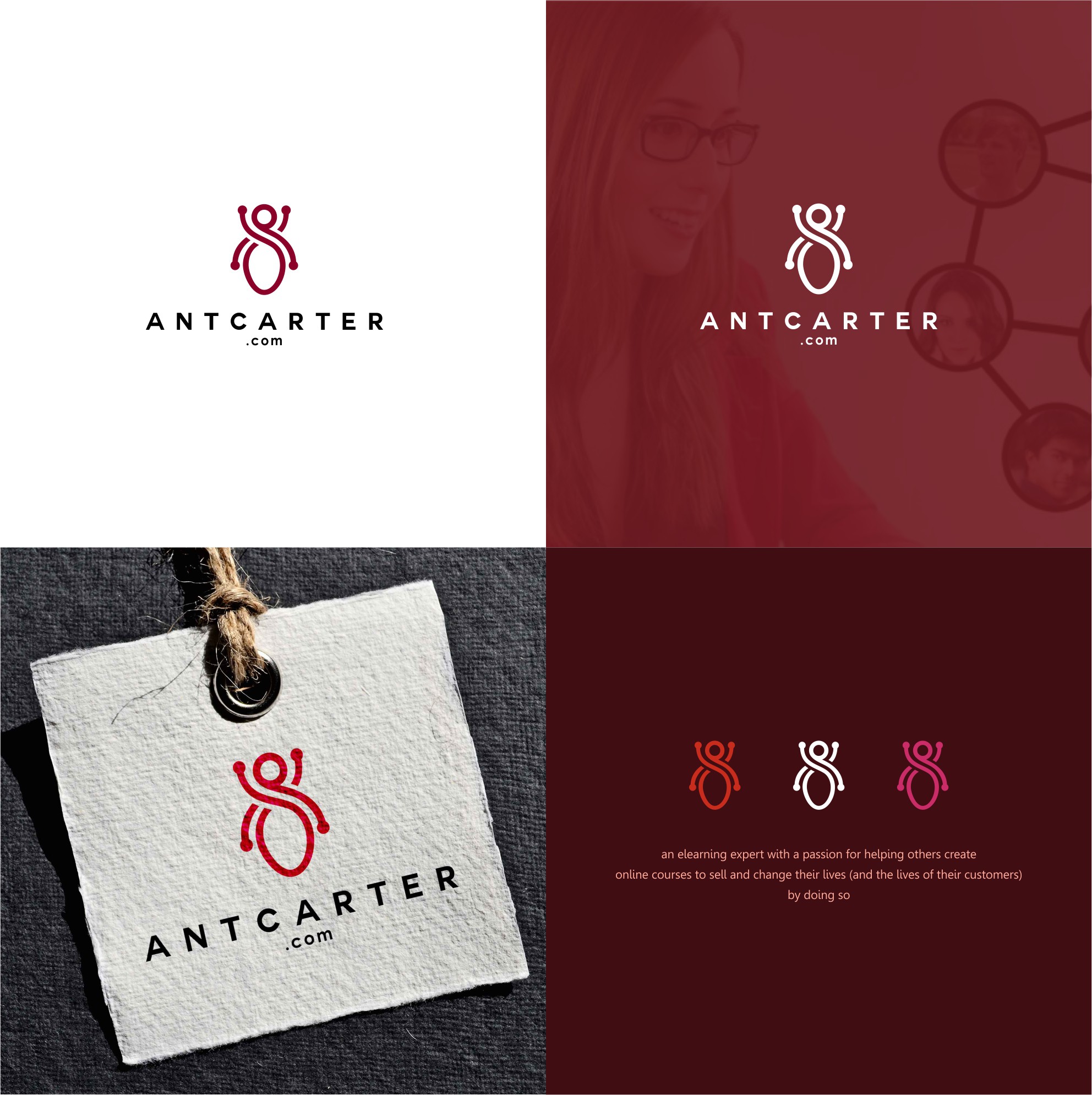
Ants are always represented by something small. To capture it in a more confident picture wasn't an easy talk. We propose a logo design with a slightly simplified concept; the leg, body, and head have been modified. But We still maintain its geometry to be recognized.
We use red to emphasize that the brand we are working on has the courage and confidence in doing the learning task. The dot at each end indicates a node where there is something we carry on. This is what I like.