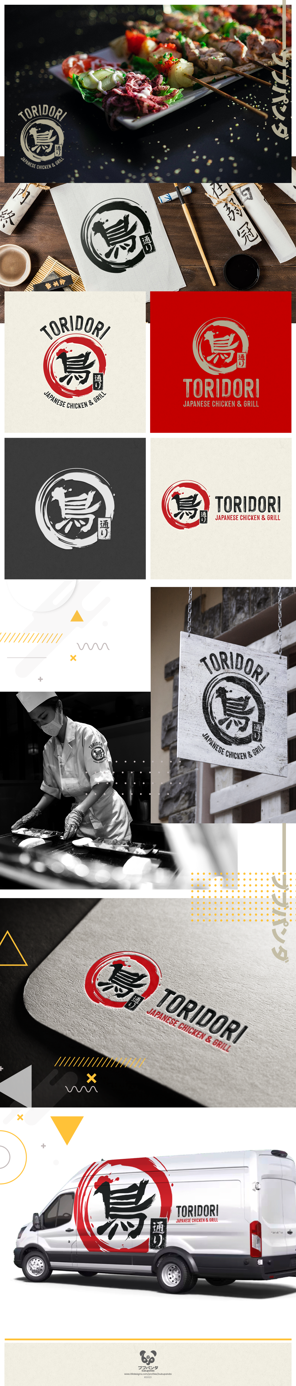

The ToriDori logo is a vibrant celebration of Japanese culinary artistry!
At the heart of the design, the Kanji character for "Tori/鳥"=(means Chicken) is playfully crafted with inked brush strokes, cleverly resembling a friendly chicken—a whimsical nod to brand's delicious offerings.
Surrounding this character is an encircling ink brushstroke, reminiscent of an enso, infusing the logo with a touch of traditional Japanese Izakaya charm. This circle symbolizes the authentic and welcoming atmosphere to the food truck.
The logo encapsulates the essence of ToriDori: the fusion of artful cooking, authentic flavors, and the joyous spirit of sharing delightful Japanese cuisine. It's a symbol of commitment to crafting delicious dishes and spreading happiness, one bite at a time!
Authentic Japanese Chicken and Grill coming to Canada! ;)