
Created on 99designs by Vista
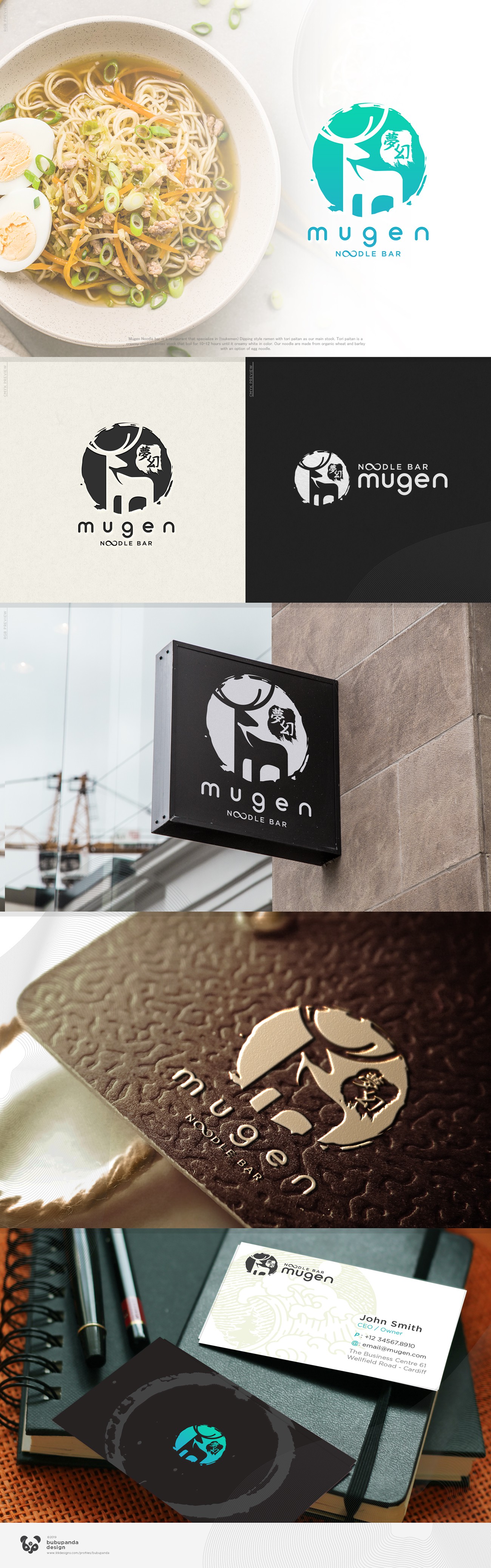
Why a Stag imagery on for Japanese Ramen restaurant logo you ask? oh, think of it, most of ramen restaurant logo on your city is bowl and noodle silhouette. Isn't that boring? :p we need to jump out of the boring box!
The restaurant is located on Portland Oregon, which is known for it's white Stag, so I came up with the idea to incorporate Portland, noodle and Japanese vibe into one single logo. A negative space of a stag with noodle horn on abstract Japanese ink wash (Ensō) background will do the work, with mugen kanji strokes to emphasize on Japanese vibe. A lot more Simple iconic and memorable than just bowl and noodle right? :)